The Wealth Gap & The Fall of Empires
News
|
Posted 27/02/2024
|
2714
We speak often of the rise and fall of empires or the changing world order. The best summary and link to fuller explanations can be found here – a MUST READ in our opinion. What makes that link particularly powerful is it is the thoughts of possibly the most respected person on Wall Street, Ray Dalio, head of the world’s largest hedge fund. Not a ‘crack pot gold bug’, but an observer of history and deep thinker. Indeed, he is often quoted as once saying “If you don’t own gold you know neither history nor economics”. That was a few years back so where are we now?
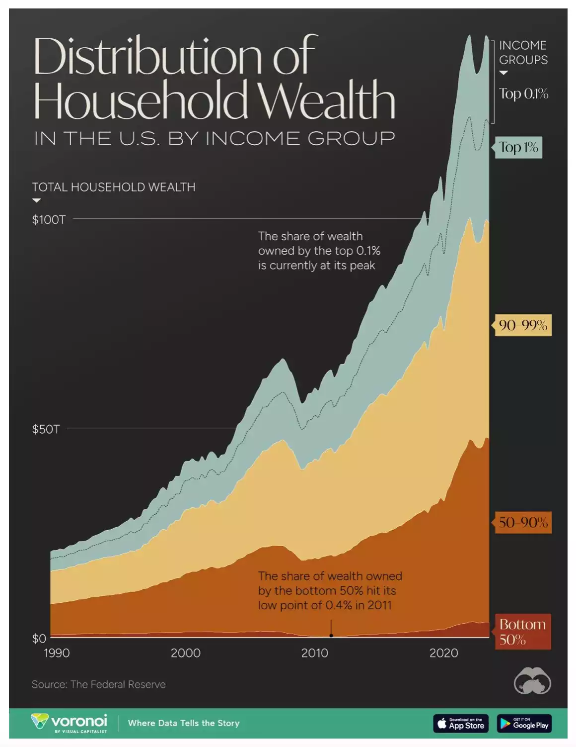
The good people at Visual Capitalist have just updated their distribution of household wealth in the US graphic. To say it is shocking is an understatement…

As you can see, the top 0.1% of American households just hit a new peak with around 131,000 households having a minimum of $38m in wealth and each earning around $3.3m per year. Where we see the societal tensions form that Dalio speaks to is the perverse divide between the ‘haves and have nots’. The chart above displays this in technicolour with the top 10% worth more than all the bottom 90% combined. More sadly, the bottom 50% own just 3% of US household wealth.
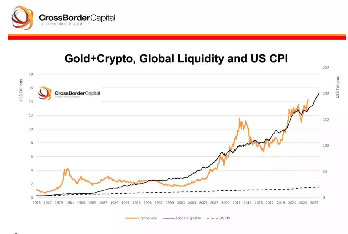
If you want an explanation of this in one simple chart look no further than the following from Cross Border Capital and more fully explained in our monthly Global Liquidity update (the last one being here and the next (and new improved format) this Friday so don’t miss it!).

What you are looking at is the value of holding real hard monetary assets like gold, silver and bitcoin verses fiat currency, or not being able to own these assets at all. When you consider wages are generally pegged to CPI (inflation) and if you leave your money in the bank (where net interest rates rarely exceed inflation) you are inextricably tied to that bottom dotted line. Whilst people talk about gold being an inflation hedge, they are often thinking ‘main street’ or CPI inflation not ‘monetary inflation’. The solid black line is effectively tracking monetary inflation, the supply of new liquidity, largely off debt. Indeed it is no coincidence that this chart starts immediately after we left the gold standard and started on the credit cycle or debt cycle that inevitably follows the discipline of gold that Dalio talks to. Such cycles enrich the rich who own the benefiting assets and impoverish the rest who don’t or can’t. Inevitably we have the types of societal breakdowns or revolts that litter history and see entire empires fall and monetary (or more accurately, currency) resets. Every single time in 5000 years, those who held gold or silver survived or thrived.
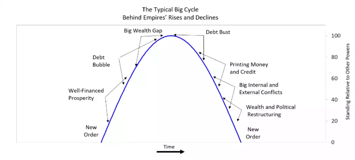
Such historically generationally unprecedented events are hard to grasp and discounted as ‘couldn’t happen this time’ by most. When someone as ‘main stream’ as a Ray Dalio is shouting from the rafters its worth listening to. He maps out these cycles as follows:

You can decide yourself where we are on that curve on this cycle. What is just plain fact is:
- We have the highest debt burden in history
- We have had central banks printing money at an unprecedented rate, in large to pay the interest on that same debt pile they expand each time they print
- We have the largest economies in the world relying on government deficit spending (adding more debt)
- We have a simply massive wealth gap
- We have signs of societal revolt in the likes of Trump, Brexit, a huge far right move in European politics, and the likes of the new Argentinian President calling out the charade publicly.
- We have increasingly heightened external conflicts and geopolitical tensions.
What few understand is that anyone can own gold and silver, both available in small format bars or coins at relatively low cost or bitcoin at any fraction (8 decimal places!) and start protecting their wealth and joining that gold line in the chart above. The following quote cannot be ignored when considering where we are at this historic juncture.
Better a year too early than a day too late.