Asset Correlation as dot.com high exceeded
News
|
Posted 13/11/2023
|
1861
Gold had a lacklustre week last week, as did bonds, whilst the S&P500 surged higher. Beyond that headline lies some truths that can’t be ignored. Firstly, economic indicators continue to come out of the US data pointing to a recession ahead and when one looks behind the headline S&P500 number there are troubling signs below.
Firstly the chart below illustrates the above commentary for the week:
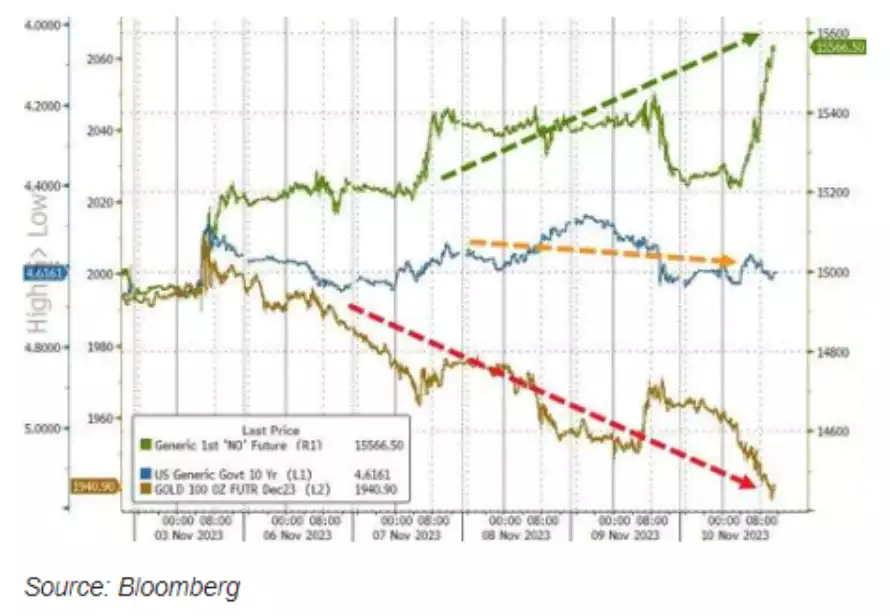
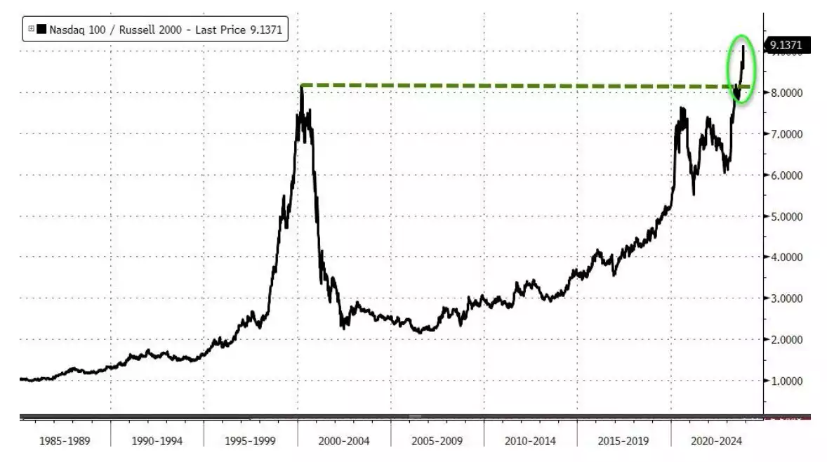
However that S&P500 rise was ALL the ‘Magnificent 7’ (Meta Amazon Netflix Alphabet Microsoft Apple Nvidia) we discussed here. Taking these away and the small caps, defensives and cyclical shares were down on the week. That is not an indicator of a healthy market nor economy. Indeed the NASDAQ versus Small Cap shares now exceeds even the dot.com bubble:
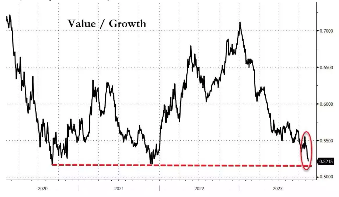
Looking at it a little differently, if you compare Value shares compared to Growth shares they are plumbing what historically has been a resistance low:
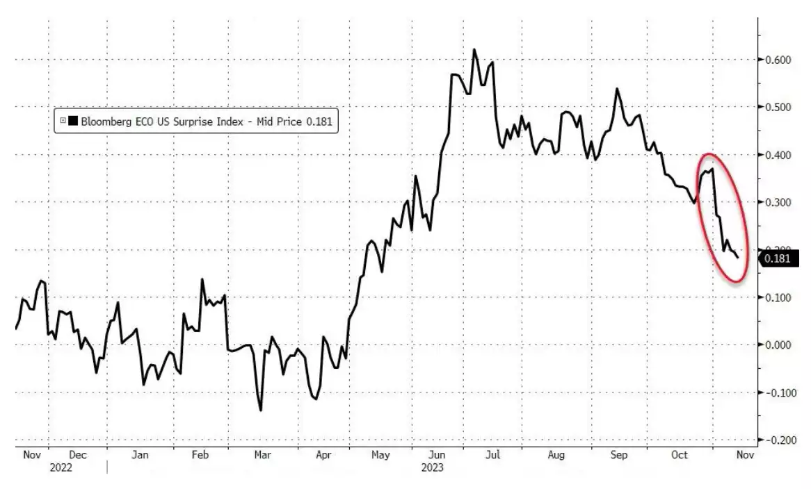
It’s at times like these one needs to look again at the economic backdrop to make sense of this and quite frankly it continues to deteriorate as the Bloomberg Eco Surprise Index below paints a clear picture of:
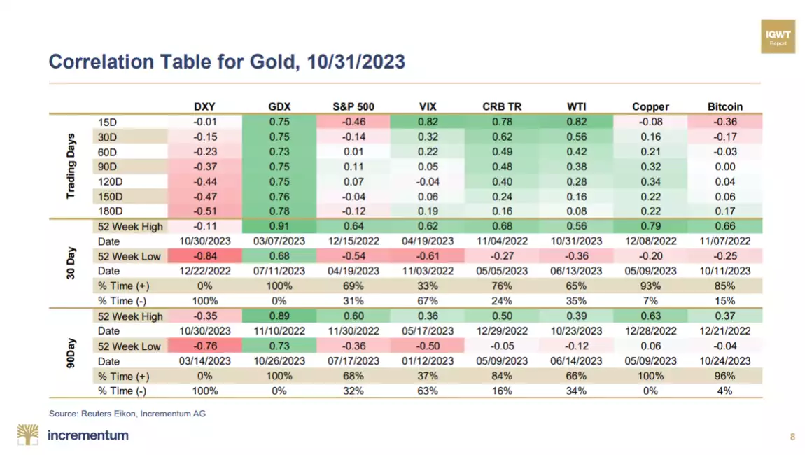
And so it is particularly timely to remind ourselves of gold’s performance when all this goes wrong. Whilst everyone talks of ‘balance’, what is critical is correlation or more particularly, lack of correlation between your various assets held. One of the most respected precious metals reports, the In Gold We Trust report from the guys at Incrementum produce the following which clearly illustrates this (remembering a correlation of 1 is 100%, 0 means no correlation and negative is the reverse).
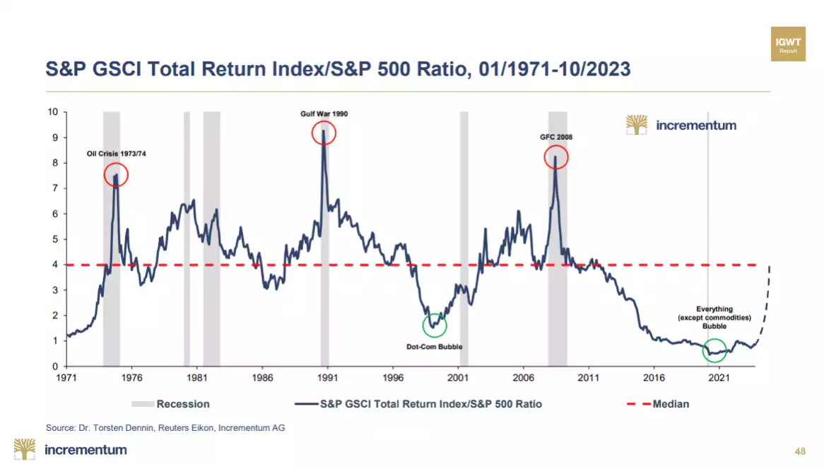
The strength of the S&P500 elevated by those growth tech shares is also counter to the rest of the world. The following chart clearly shows the (again similar to dot.com top) how totally, historically out of whack the US market is to the global sharemarket index:
And so finally, despite gold being at near all time highs despite a couple of down weeks, it is important to look at it against that S&P500. You can see we are still well above, and at historic highs, in that ratio regardless.
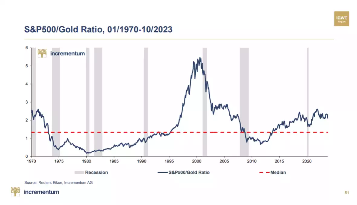
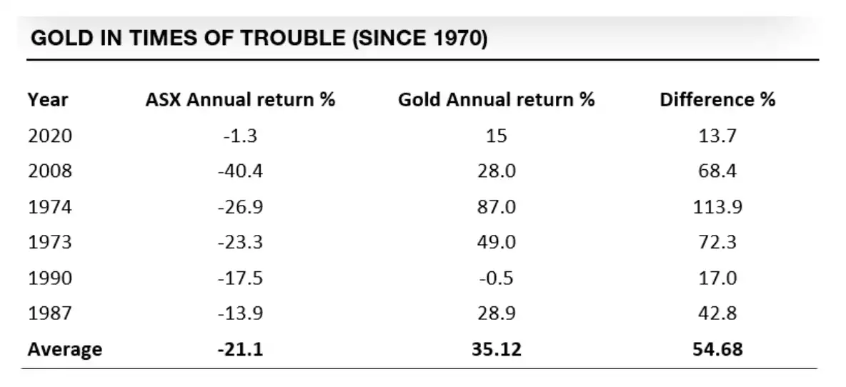
Our trademark is Balance your wealth in an unbalanced world and you can see the imbalance at present. Gold, despite being high, looks more like the start of a bull run then end. As a reminder – here is the Aussie history too…
