‘In Gold We Trust’ Preview – Institutional Impact & GSR
News
|
Posted 12/03/2021
|
8288
This is our final preview of the upcoming ‘In Gold We Trust’ report by Incrementum. The report is arguably the pre-eminent annual report on gold and silver, read by over 2m people in 2020 and due out in May 2021. Today we look at the relative size of precious metals markets against the institutional funds, what that means and a special look at silver.
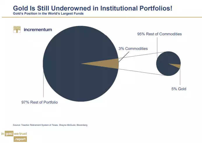
We often talk of gold’s value being the fact it is a relatively rare, supply constrained hard asset with a very high stock to flow ratio. Whilst normally in terms of intrinsic value and the fundamental monetary properties that provides, the incredible upside potential also rests with how few currently hold it and how little supply there is when more want to on any meaningful scale. The following chart illustrate clearly that gold accounts for just 5% of the 3% of commodities held by institutional portfolios, that is just 0.15%.
And that is after record inflows into gold ETFs in 2020:
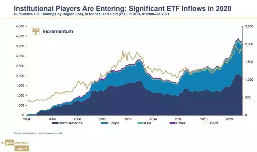
And as we discussed on Wednesday, US equities have been the star performer since the GFC and so despite these inflows, that gold ETF investments by these funds compared to equities, are still well below their 2011 highs at around 0.6% compared to around 1.1% then.
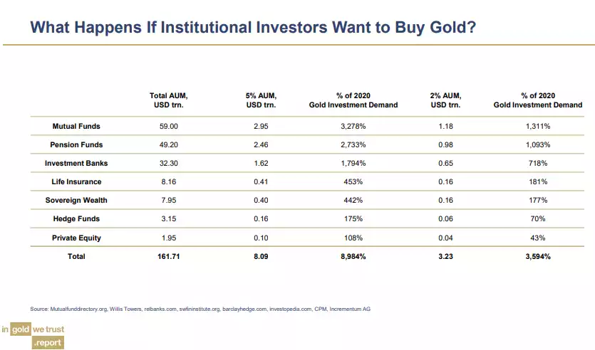
The following table beautifully illustrates the incredible change in demand of the small inelastic gold market should these institutions increase the assets under management of gold to just 2% or 5%. Please take the time to digest those totals at the bottom. A 3,594% or 8,984% over and above the TOTAL 2020 gold investment demand respectively with NO ability to simply create more as they can with bonds etc.
Put pictorially, the chart below categorises major institutional global assets and compares (put your glasses on) them to total global gold investment holdings and that for just 2020 (grab the microscope).
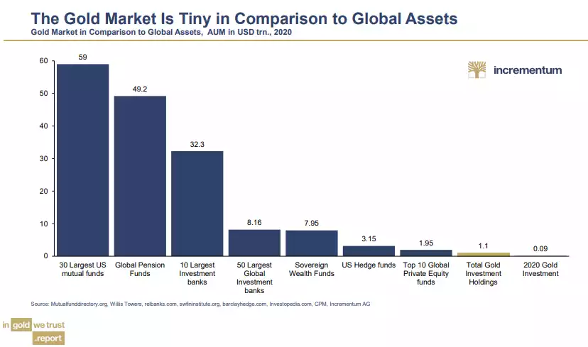
Whilst all eyes are on Bitcoin at present with its continued spectacular returns amid the same constraint of supply but being a relatively new asset ‘finding its fair value’, some write off gold as ‘boringly mature’ having ‘completed’ that fair value exercise. However, if we compare Bitcoin now with its $1 trillion market cap against gold’s $9 trillion market cap, we must remember that the total readily investable supply of gold is more like $1.5 trillion. BOTH are minute in the ocean of assets and both would rocket in price if markets even saw even meagre asset reallocations as illustrated in the 2% and 5% example depicted above.
However the discussion above is all about investment supply. In addition to this, gold has seen massive buying by central banks, particularly since the GFC. The chart below illustrates this:
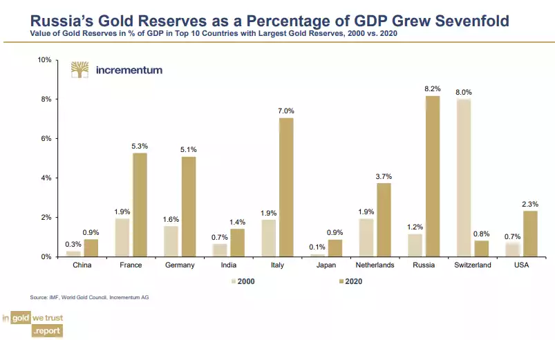
The world is only becoming more and more uncertain, carrying more and more debt and the USD and its bond instruments becoming more and more under threat. Central banks are highly motivated to shore up reserves with an asset without counterparty risk. There is no coincidence they have been net buyers in no small order since the ‘oh sh!t’ moment of the GFC when we got our first real glimpse that this epic, globally cross collateralised, exceptionally leveraged, artificially inflated credit cycle was showing signs of terminal cracks.
And so, what if, as has happened every time a major credit cycle and its Fiat currency system ends, we go back to a gold standard of sorts? As with the last Bretton Woods system, a fully gold backed system is considered impractical, unnecessary and nigh on impossible regardless. A common school of thought is a system where that M2 money supply discussed yesterday is backed by 40% in value with gold. The following chart shows what that would mean to the value of gold… USD24,000 right now and remember that M2 is still rocketing up.
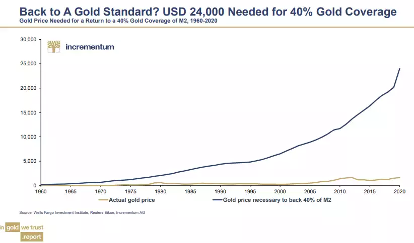
If you are curious, the ratio right now is around 12% with gold priced at USD1700….
Now all of the above is about gold. So what about silver you ask? Well Incrementum are unashamedly VERY bullish on silver and talk to many of the same points we keep reporting.
First, lets look at its historic performance for context. The table below is a repeat of that shared on Monday here.
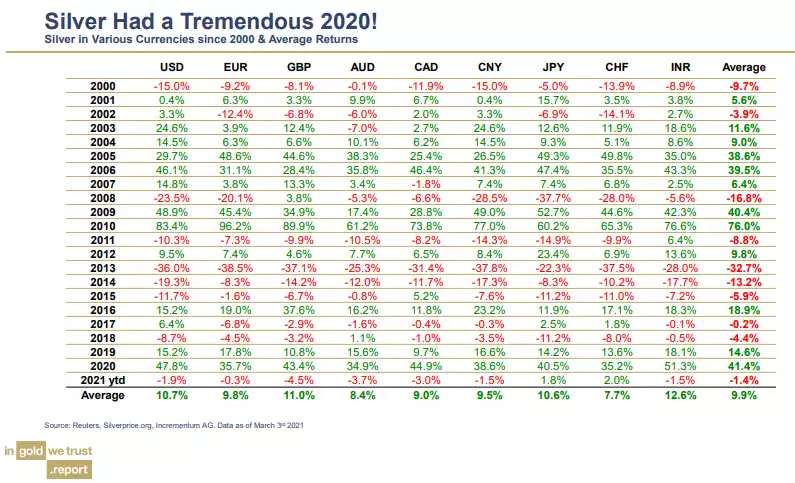
You will have noticed on Monday its relative volatility compared to gold. Volatility, if it rhymes as silver often does, is just a great trade opportunity if you have the ability to park emotions at the door. And whilst yes, silver had a cracker of a year in 2020, in terms of that ‘rhyme’ being the Gold Silver Ratio (GSR) the potential is still there for what is unfinished business in the usual mean reversion.
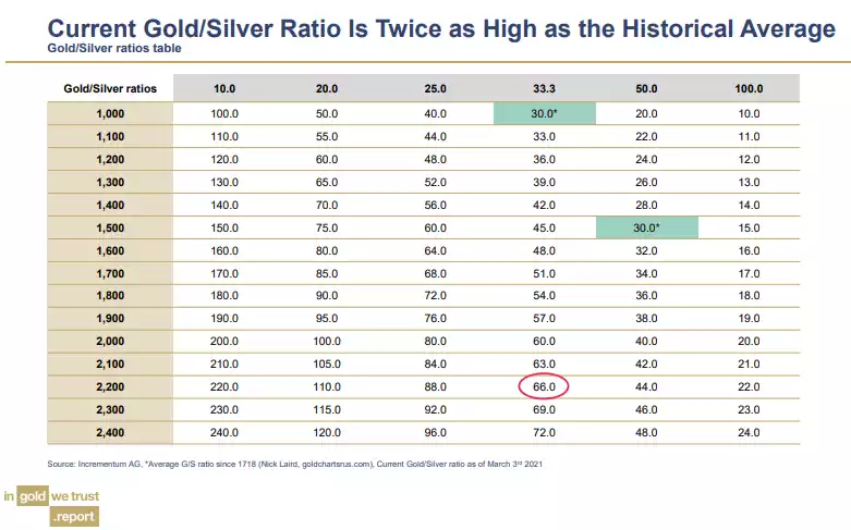
Since 1718 the GSR has averaged 30. The table below plots out the gold price on the vertical axis and silver price in horizontal and shows the current 66 GSR. Have a play with that table and just try not to get excited about the potential silver price even if gold doesn’t move from its current US$1725….
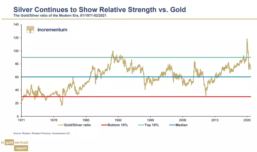
Looking back 300 years we see that 2020 posted the highest ever gold silver ratio. However note that before 1900 silver barely changed and this was largely through government edict.

I therefore prefer to look at the last century on for more relevance and you are more around the 45 to 50 mark. Indeed if you look just since the end of the gold standard we have a median of around 60. You can see even with the reversion down to 66, we are still a LONG way from the completion of an historic reversion of around 30:1. If that were tomorrow, at gold worth AUD2,212 your silver would be worth $74/oz.
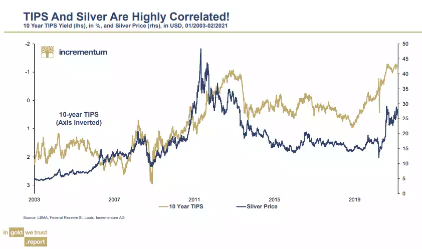
And remember, just as with gold, silver enjoys a great correlation with inflation and indeed it is outperforming gold right now on the reflation trade playing out. The chart below shows that correlation with the inverted 10yr TIPS (inflation-adjusted interest rates on 10-year Treasury securities).
We hope you have enjoyed us passing on these charts this week with our own words. We will no doubt revisit when it is released (with their words!) in May. For now, this is how they summarise:
