Why a US Recession Looks Imminent & How Just 10% Gold Wins
News
|
Posted 06/02/2020
|
18341
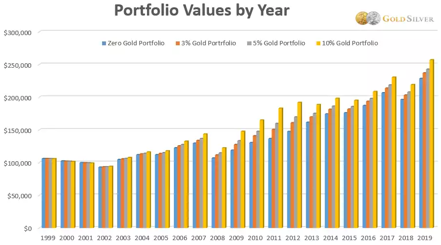
Following on from yesterday’s article on the warnings signalled from valuations and inversion of the UST yield curve, today we look further into the latest Crescat Quarterly Report and share an analysis showing how just having 10% of your portfolio in gold would have seen you outperform every year for over a decade.
So clearly valuations are sky high but what about the underlying economic health of the world’s last hope; the US of A?
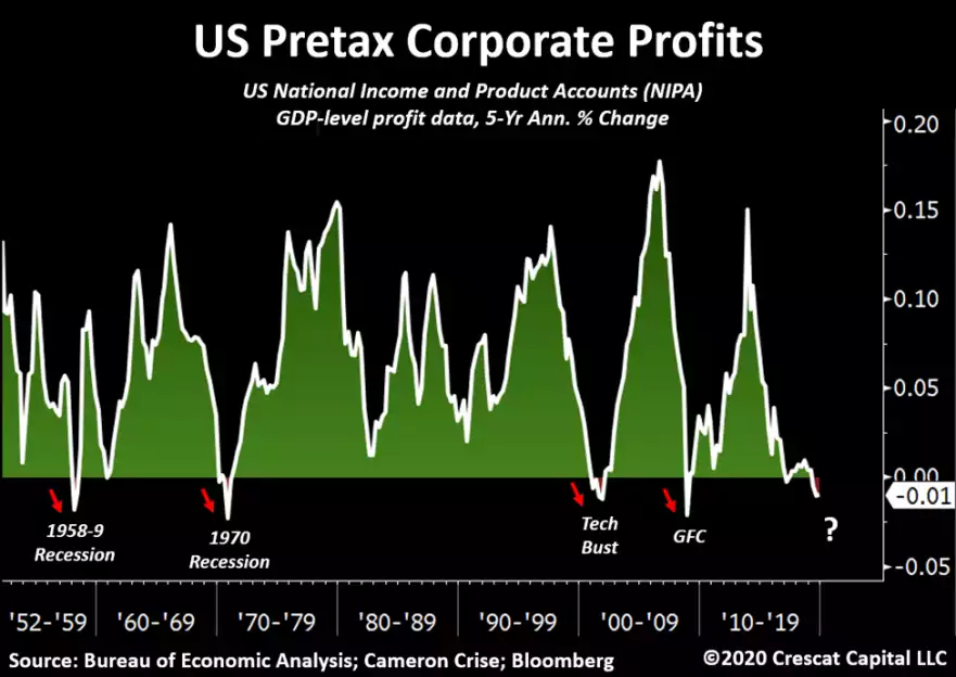
“Another factor not currently in our model, but that could be, is change in US economy-wide corporate profits based the US National Income and Product Accounts (NIPA). If the bull case for stocks and the economy is that corporate profits are poised to scream higher, the GDP-level profit data tell a completely different story. If this were really the greatest economy ever, American business profit growth would not have been grinding lower for the past five years. And it would not have just turned negative. But it did. As we show in the chart below, every prior NIPA profits’ recession of the current magnitude bled into a full-blown economic one. NIPA profits normally track S&P 500 profits. The last time NIPA diverged from S&P 500 profits in the way it has today, it was the peak of the tech bubble.” In short they are referring to the fact that profit earnings reported include (speculative) investment capital gains. Remember US corporates have been buying record amounts of their own shares in this rising sharemarket. Indeed as we have written ad nauseum, probably fuelled most of those gains. NIPA strips that out….
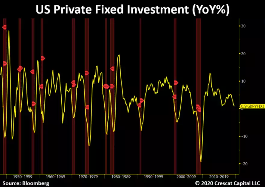
Not surprisingly then, their CEO’s have been keener to buy back their own shares (pump up the price and get ‘earnings growth’ bonuses) rather than reinvest into the business. To wit:
“Similarly, corporate investment for the US economy as a whole has been slipping and does not bode well for future corporate profit or economic growth. Note the late-cycle declining trend in year-over-year fixed investment growth and how this prior pattern led to outright CAPEX declines and recessions except in a few mid-cycle soft landing situations. We are extremely late in the economic expansion cycle today.”
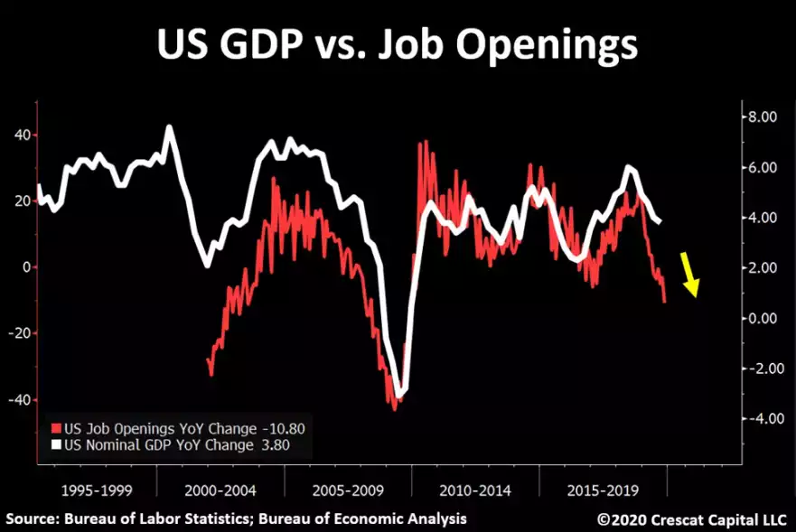
Job openings have been falling precipitously. Simplistically people see this as ‘good news’ as things must be great if unemployment is low and openings tightening. But history says otherwise:
“The labor market is a critical part of the business cycle paradigm and is undeniably deteriorating. The latest job openings number confirmed again its declining trend. It is now falling by over 10% annually. As shown below, this indicator follows GDP growth very closely throughout history and suggests even further deceleration in the economy.”
And if you think that is a tight correlation, try 0.97 on their following analysis:
“We recently had another predicament. Continuing jobless claims are now rising the most since the Great Recession. This index tracks the unemployment rate with an exceptional 0.97 correlation since 1968. Keep this in mind as the labor market holds the key for the business cycle.”
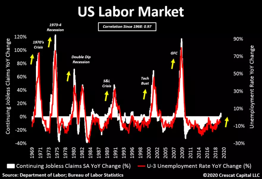
In other words, low unemployment can turn quickly to high unemployment when we have these conditions.
Clearly the economic back drop does not support such record high prices. Before we get into gold’s role in such times, maybe the following chart says it all. The Dow Jones priced in gold is at levels seen before the Great Depression.
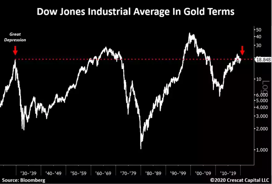
And whilst arguably gold is not a commodity anymore it still gets lumped in that cohort. Silver on the other hand most definitely still is and the following chart and preamble should be cause for consideration. We’ve shared this a few times over the last couple of year but it just keeps getting more and more compelling:
“With valuations of financial asset so frothy relative to inflation, commodities are the only value-oriented asset class in the market. They have been left for dead in the current business cycle. We believe commodities are setting up for a generational buying opportunity.”

The following chart courtesy of Mike Maloney compares the performance of investment portfolios with varying holdings of gold over the last 20 years. Since the turn of the century you have been better off with gold in your portfolio.
