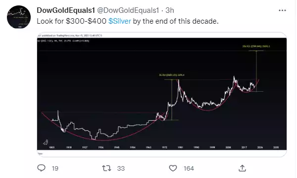
The road to “$300-400 silver” – 7 Must See Silver Charts
News
|
Posted 16/11/2022
|
16387
It was an ordinary night for silver last night after what has been a strong month. Spot silver fell 2% whilst gold was up. More broadly however the charts are looking great for the metal that wears 2 hats – half monetary metal, half industrial commodity. Let’s have a look at a few doing the rounds on twitter right now.
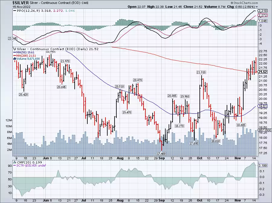
First, a reminder of the month silver has had, up 20% since the October low and finally breaking through the 200 day moving average. Last night it kissed the 200 DMA but has held (USD21.57 at time of writing) bouncing off it.
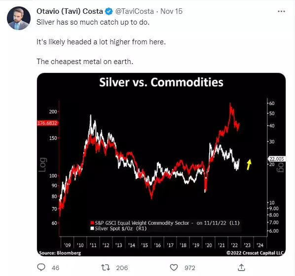
Despite these gains, silver is still incredibly undervalued compared to the broader commodity complex:
Zooming in on that bounce @Gold Ventures shared the following chart:
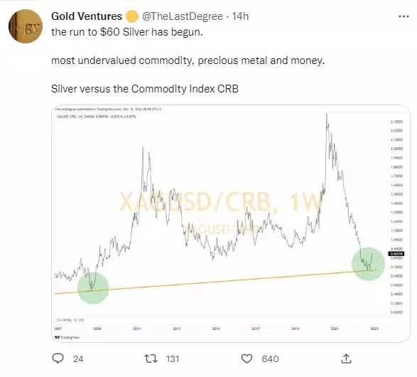
More broadly again, from a purely technical perspective, we are witnessing a long term cup & handle formation for the ages.
On a tighter timeframe our own weekly Insights Charts breakdown yesterday saw Joe conclude the bottom is likely in for silver. Its definitely worth a listen (click on image below) as Joe looks at all 3 precious metals charts.

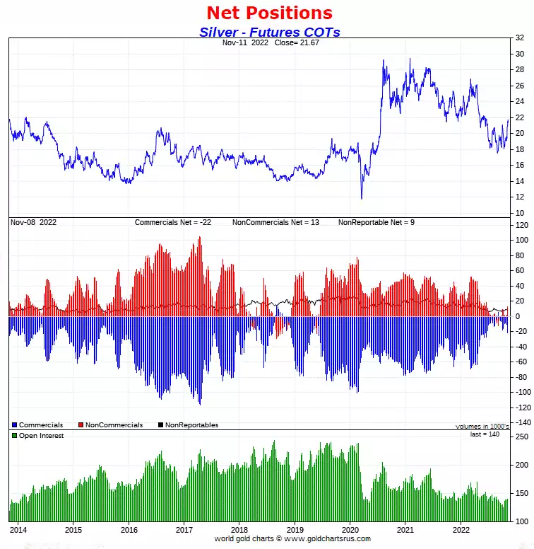
“Yeah but what about those monster shorts on COMEX” you say? Again we are staring at an historically bullish set up for silver as the Commercials no longer have shorts of substance and the hapless Non Commercials are barely long.
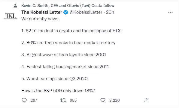
As we discussed earlier this month with the release of the World Gold Council’s Gold Demand Trends report there has been a rotation out of precious metals by managed funds due to ‘computer say sell’ as rates rise without looking at why rates are rising and the pile of debt behind them. The following tweet today is a reminder why you may want to be in defensive assets right now… i.e. the financial markets carnage aint over…
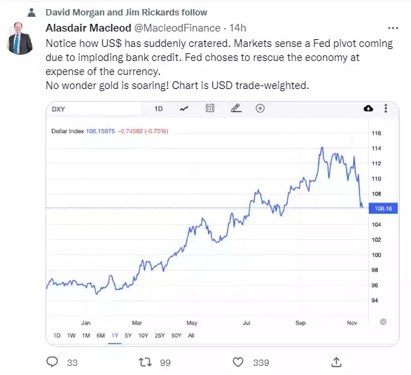
And finally, some would argue there is only one chart to watch, and that is the USD…