Speculation Enters Most Markets – But Which Ones Survive?
News
|
Posted 07/11/2024
|
2038
Speculation has started entering most markets, and with them, due to ride an upcoming wave of global liquidity together - we can expect this speculation to grow exponentially in the ongoing phase of the global macroeconomic cycle. But which ones come out on top long term? Let’s look at some current and historical data.
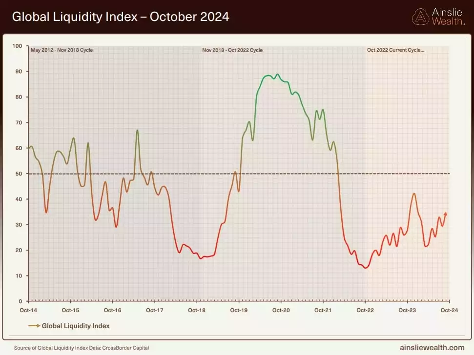
Global liquidity is primed to increase, currently about 33% of the way through the macro cycle.
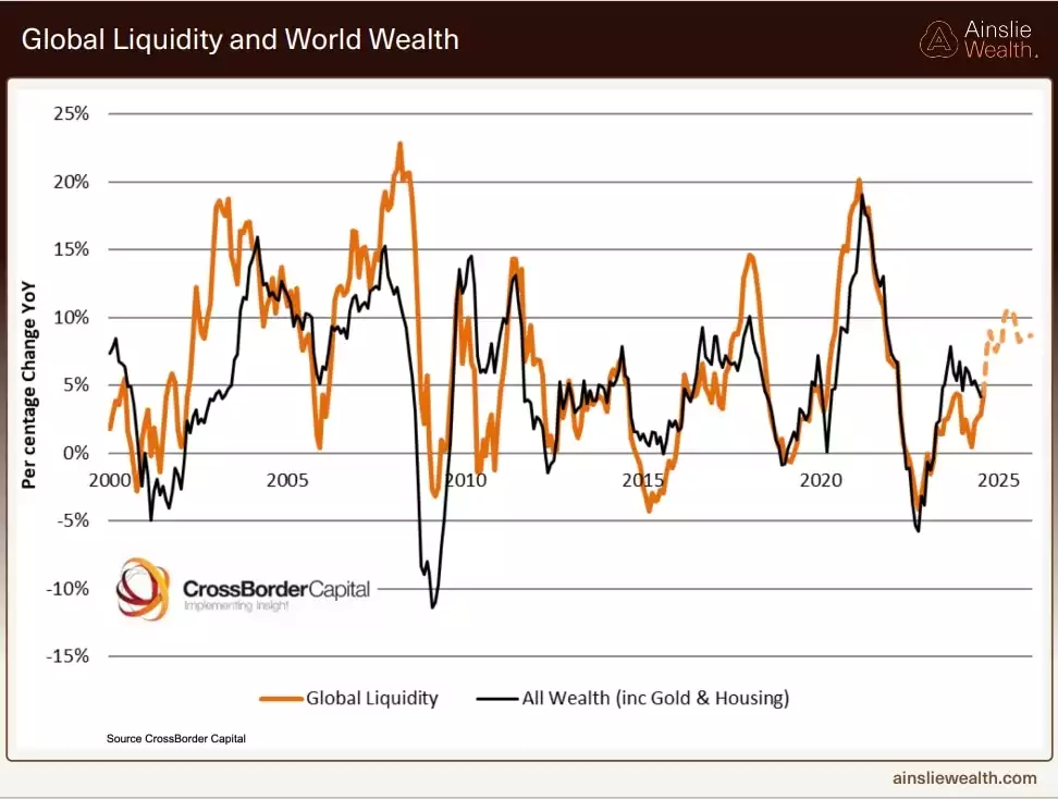
The case for an upcoming wave of liquidity
Central banks around the world are moving towards liquidity injections and easy monetary policy. The largest central banks - the U.S., UK, Eurozone and Asia are all simultaneously cutting interest rates, having embarked on a rate-cutting cycle. With a U.S. Fed rate-cutting cycle is in motion. Markets are pricing in a 95% probability of a 25-basis point interest rate cut, at the Federal Reserve's meeting this week. As government bond yields and central bank interest rates usually move in tandem, we can expect government bond yields to continue dropping - leading the rate-cutting cycle by a few months.
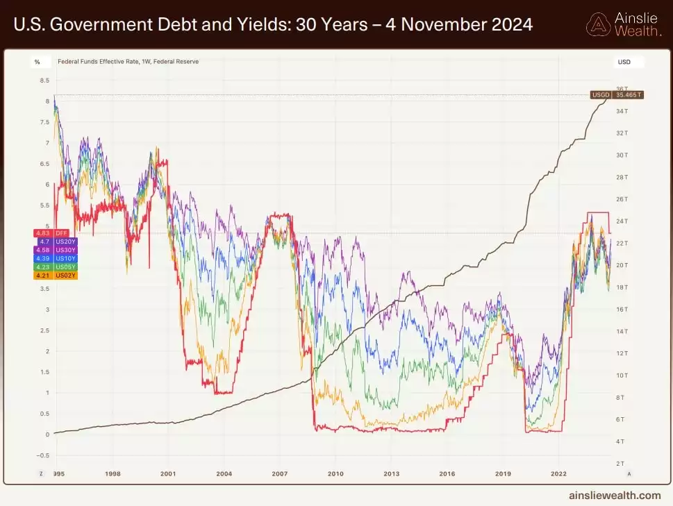
The bond yield chart has been putting in successive lower highs and lower lows all year, leading to the onset of the rate-cutting cycle.
Lower bond yields increase bond collateral values (as the previously higher-yielding bonds are now worth more in the secondary market). As U.S. government bonds make up the primary collateral held by private banks - higher collateral values increase the bank’s lending capacity - increasing private liquidity injections into the financial system. Lower interest rates also improve borrowing capacity - further bolstering private sector liquidity injections.
The world’s second-largest central bank - The People’s Bank of China - has recently injected large amounts of stimulative liquidity - this is expected to continue as it has entered an annual seasonal phase of easy monetary policy - in the second half of the year.
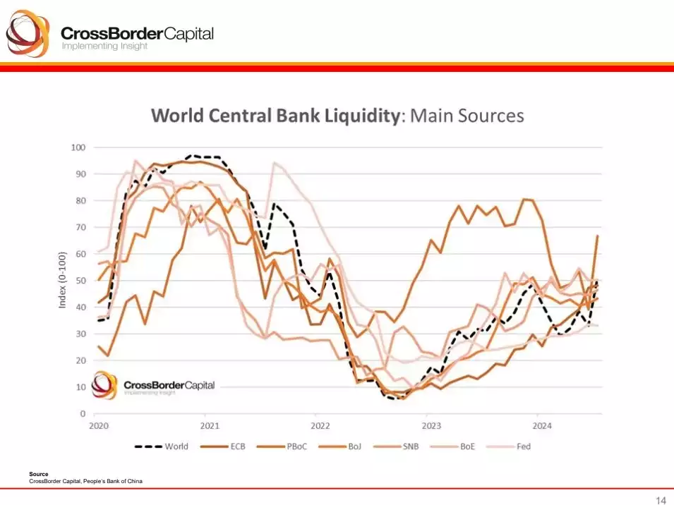
As global liquidity increases, so do investor’s risk appetite and speculative tendencies – causing most markets to rise together.
The Russell 2000 – reflecting risk sentiment.
To help decipher how “risk on” the current macro landscape is, and its trajectory - we can look at the low market cap investment of choice, for stock investors - the Russell 2000 - a stock market index that measures the performance of the 2,000 smallest companies from the Russell Index. A strong Russell reflects an increased risk appetite among investors, often driven by looser monetary policy.
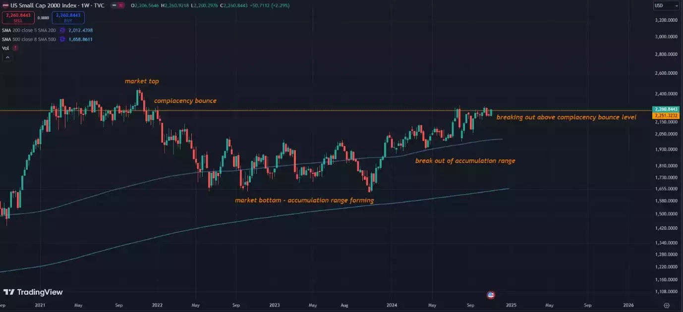
The chart above shows the R2K having previously peaked in December 2021 with a “complacency bounce” in early 2022 – following which it collapsed and entered the accumulation phase of the next bull cycle. When the next macro bull run started - we saw the price working its way up, out of this accumulation range.
The peak of the complacency bounce usually provides strong resistance - as this was the last time markets “felt good” the trading volume at these levels was quite high. Breaking and holding above the complacency bounce level is a clear sign that the new macro bull run has legs - that the wall of worry is nearly ascended - and that the last bears are being converted to bulls.
Holding above the complacency bounce level is an early sign that the market has the potential to take off. As we are breaking out above the complacency bounce of December 2021 - we can note early signs of markets becoming “risk on”.
The “wall of worry” - are we nearly above it?
The “wall of worry” is a term used to describe the period in financial markets where price continues to ascend, in the midst of a variety of negative factors. Climbing the “wall of worry” is a confusing phase for market participants, with fears left and right - participants expect prices to crash - however markets keep going up.
Since the bottom of 2022, we have faced the Silicon Valley banking crisis, the U.S. debt ceiling fears, recession fears, attempted assassinations, WWIII fears and the yen carry trade unwinding. The current worry on investors’ minds, the U.S. election results, is being cleared up.
Could this be the final worry, to ascend the wall?
Once the wall is climbed, markets enter a parabolic phase of price appreciation driven by speculation and greed. However, parabolas do not last long - and almost always resolve dramatically to the downside, so looking past the speculation phase which raises all markets - what comes next and which ones survive?
While, looking forward at the immediate future of the macroeconomic picture, from a global liquidity and risk sentiment perspective - we can expect a flood of liquidity and speculation – we could zoom out to the bigger picture to investigate what follows – and which markets come out on top.
This upcoming liquidity-driven speculative frenzy - also overlays very well from a timing perspective, on the final phase of the 18.6-year economic cycle (coined “winner's curse” phase) which we are currently scheduled to be on the lookout for. This phase of the macro cycle is typical of leverage, liquidity and valuations increasing exponentially - only to be followed by a broad-based collapse. This macro land cycle is based on the past 200 years of data, where Western economies have recorded an economic cycle that averages 18.6 years (The shortest on record is 17 years, with the longest being 21 years).
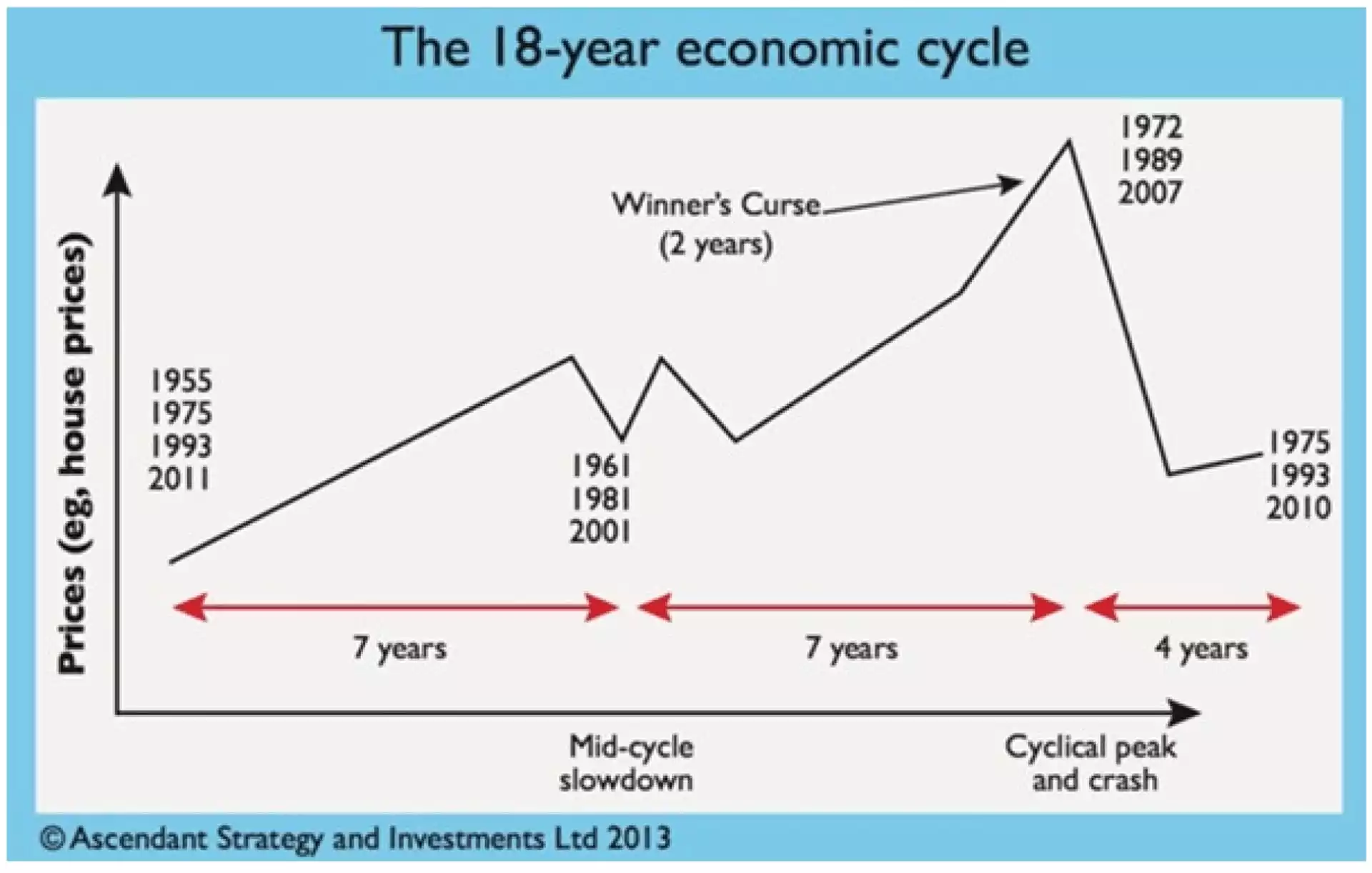
Source: Ascendant Strategy and Money Week magazine 2014
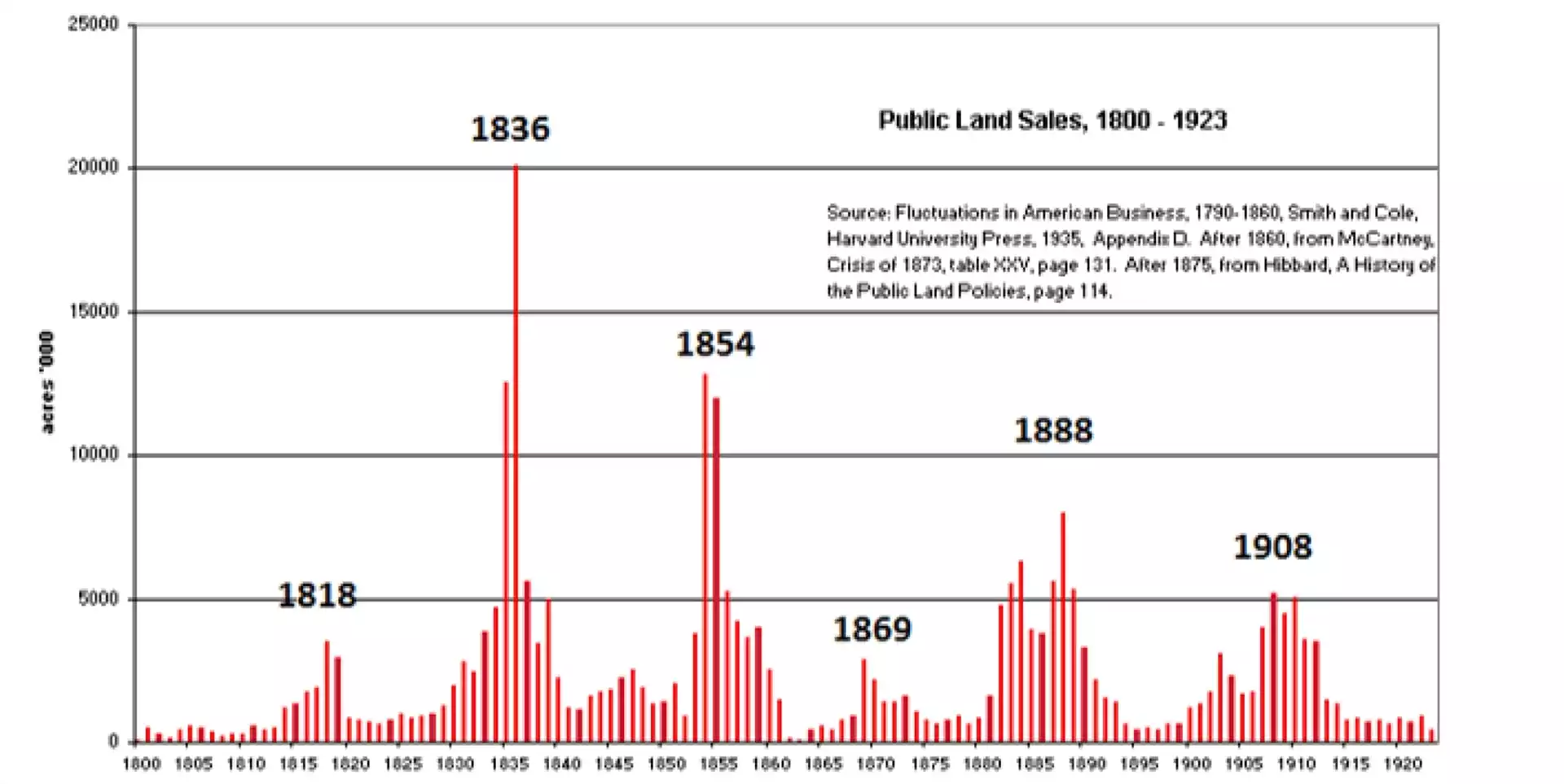
Source: The Secret Life of Real Estate and Banking
Notice the approximate 18 years between each land cycle boom – uncanny. These final 2 years (on average) of the up-phase - is coined the “winner’s curse” phase – where the economy rises as a function of increased liquidity - markets become over-leveraged, and investors become overconfident - before it all comes crashing down into a secular bear market.
Looking at the current market sentiment, we can clearly see that most investors are barely confident, let alone overconfident with recession fears still held by the mainstream consciousness.
So, while we are clearly not in the winner’s curse phase yet – we can expect it to be around the corner. Our most recent collapse, following a winner’s curse phase - was the global financial crisis in 2009. Most assets reached their peak value around 2007. As the cycle has a minimum of 17 years and a maximum of 21 years (with an average of 18.6 years) - we can expect this current cycle to peak (or the winner’s curse to conclude) between 2024 and 2028 (with an average expectation of roughly mid-2025).
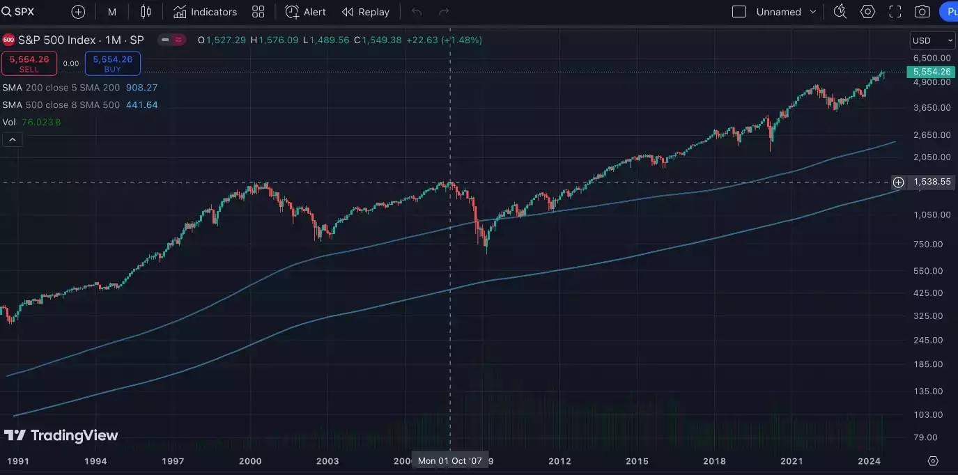
So, based on history, the current liquidity cycle and investor risk sentiment we can expect a flood of liquidity and leverage leading to a collapse. While increasing global liquidity raises all assets together, the following collapse that comes isn’t so favourable to most assets.
Gold and silver however are in a unique position of benefiting from both increasing global liquidity during the winner’s curse phase - as well as the flight to safety requirement (being decentralised, and eternal) that proliferates the recession that follows. The charts below show gold and silver reacting to changes in global liquidity.
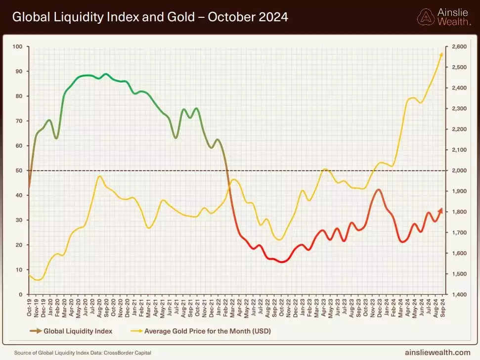
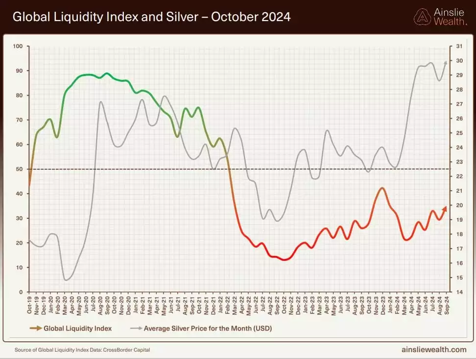
The image below shows gold VS the S&P in the previous winner’s curse phase and the collapse that followed (the GFC).
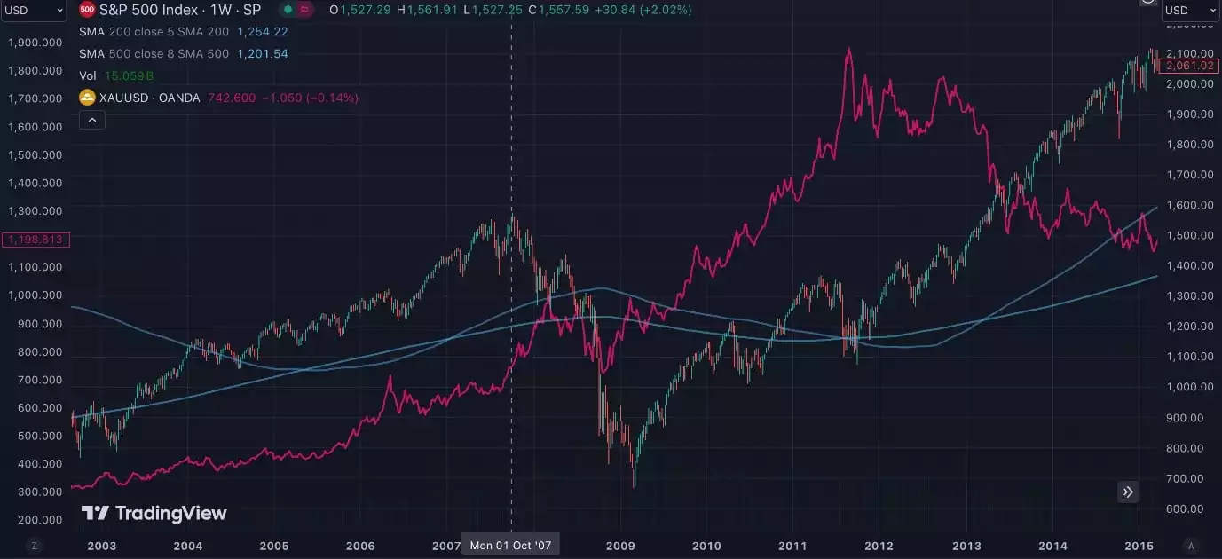
We can see gold benefit from increased liquidity and speculation leading into the collapse and then take centre stage shortly after the collapse - while the S&P struggled to recover. The same held true for most stock indices and land markets. This shows us that, in the long term, while all markets rise parabolically into the speculative frenzy, most experience a brutal collapse and recovery phase following it - while gold comes out on top.
What did silver do during this time in relation to gold? The gold-to-silver ratio shows this best.
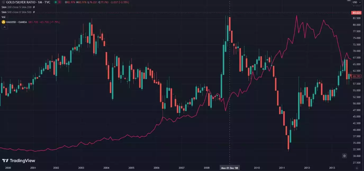
While we can see the GSR spike during the collapse, it falls off in the recovery phase. This means that as the gold price outperforms most markets in the recovery phase, silver outperforms gold. Making silver the clear winner of the long-term phase we are currently in – a speculative frenzy, followed by a broad-based collapse and a recovery phase, which lasts years.
Why does silver outperform nearly everything in this phase?
During times of crisis, investors seek safe haven assets to shelter from the storm. Assets not connected to any government or financial institution, with a proven track record - such as gold and silver. This causes a significant price increase in both gold and silver, leading to the crisis with gold outperforming silver, initially.
However, after the crisis as gold and silver have been increasing in value while most other markets are struggling – the average retail investors start truly believing the precious metals bull run, which drives speculation into these markets. With a smaller market capitalisation and lower liquidity, this speculation causes significant price increases in silver - causing silver to lead the way, subsequently outperforming gold, this causes the gold-to-silver ratio to reduce.
This is an opportunity to simultaneously capture significant capital growth, while securing a hedge against systemic collapses.
While navigating most assets can be chaotic leading into the winner’s curse - and the collapse that follows, precious metals such as gold and silver will play a key role in providing sustained growth, and shelter from the storm. Side-stepping the chaos, and rising to the top in the long term, during this macroeconomic phase.
Watch the Ainslie Insights video discussion of this article here: https://www.youtube.com/watch?v=5EeJpED1Q1Y