Silver’s GFC Pattern Has Repeated
News
|
Posted 25/05/2023
|
11858
Today we look back at that incredible silver market run up to nearly US$50 in 2011. If that happened today it would be AUD76!. There are clear similarities between then and now in the construct of the technicals and certainly worth a close eye.

After a shocking, 9.20% increase on the 24th of November 2008, silver underwent an astonishing 373% rise across the next 2.5 years. The dramatic 1-day increase was the precursor to what would become years of an aggressive silver bull market.
On the 3rd of October 2022, the biggest daily increase since then occurred: Roughly 8.90%. That marked the biggest 1-day increase since late 2008. Could this be another precursor to a silver bull market, or just a dud?
How do the price action patterns compare?

The patterns around both record daily rises are eerily similar:
- Both are nearly the same percentage.
- Both are coming after recessions.
- They are record daily rises as bounces.
- And the white boxes look almost like a Copy + Paste.
Now let’s look at the same weekly chart with a 200-week moving average, MACD and candle pattern combination:

Notice the Bullish candle pattern after 2020 that led to an initial aggressive increase. This increase flipped the 200-week moving average to green. The retracement in 2022 then rebounded with the shocking nearly 9% rise mentioned earlier and followed with a continued rise which has kept the 200-week moving average green since then.
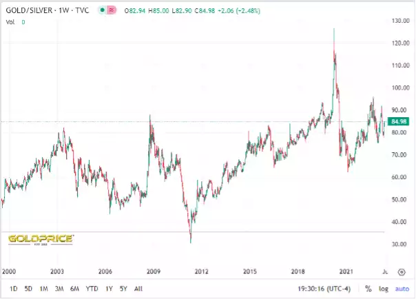
2011 was also notable for the Gold Silver Ratio dropping to just 30:1 after peaking at 85:1 during the GFC. The GSR also now sits at a still high 85:1… We last fully explained the GST here in 2021 which also talks to one of the best ways to trade it using our Gold Standard (AUS) and Silver Standard (AGS) 100% bullion backed tokens on CoinSpot. Our last update in late March is here.
Besides the chart patterns, we also have what has been happening behind the scenes in the banking world. According to CNN, late last week Treasury Secretary Janet Yellen told the executives of major banks that more bank mergers may be necessary. She also noted that the nation's banking system was built on a strong foundation, which seems like an attempt to quell outright panic. This looks like a call for smaller banks and depositors to simply acquiesce in a process of banking consolidation. The article also refers to JPMorgan Chase's purchase of First Republic as "That deal, which came after a competitive bidding process and was aimed at stabilizing the system...", instead of a sweetheart deal in which the value of what was acquired, far-exceeded the cost.
Meanwhile, the SP500 has tested a 2% fall in the last 2 days, and we all know that this major index dropping can fuel panic. AUD/USD has followed suit and has been smacked down to the 65 cent level. For those unfamiliar with the currency pair, it's a great metric for the overall health of the global economy and it has just reached its lowest point this year.
The FOMC minutes that were released this morning caused a bit of pullback in markets, but revealed that the Fed is divided on future rate hikes. Simply being divided is not the answer bulls were looking for. The fact that there was still mention of persistent inflation shows that the Fed may maintain its hawkish stance until something breaks.
With risk markets struggling, Yellen promoting the idea of more bank mergers, and the potential for something in the economy to break, we will see if this pattern is just a mere coincidence or if it is a tell-tale sign of another multi-year silver bull run.