Silver – 6 salivating charts
News
|
Posted 28/09/2018
|
11848
Today we share 6 charts clearly building the case for a major silver rally (5 courtesy of SRSrocco). A few weeks back we wrote an article comparing gold and silver now to the previous 2 market crashes. It included the Dow/Silver Ratio but here it is again annotated as a reminder...
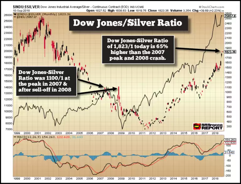
So let’s compare the technical setup for each in that ratio. First the Dow Jones Industrial Average (and remember it’s the tech stocks that are really pumping valuations, more so than industrials…)
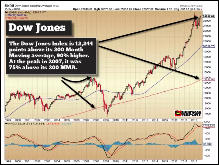
For that chart to revert to its 200 MMA would see a 50% fall in the US stock market.
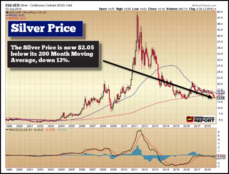
In stark contrast, whilst shares are hitting all time highs and 90% above their 200 MMA, silver is bouncing along the bottom and 13% below its 200 MMA.
As a reminder too, the big commercial silver hedgers on the futures market, the so called smart money, are net long for the first time in 25 years.
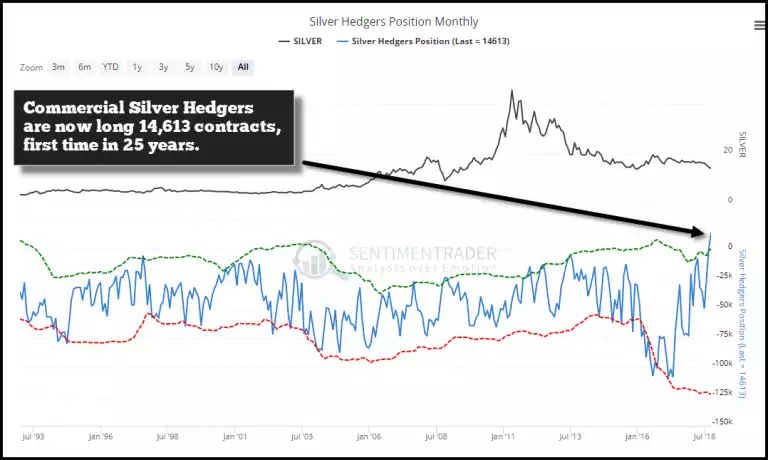
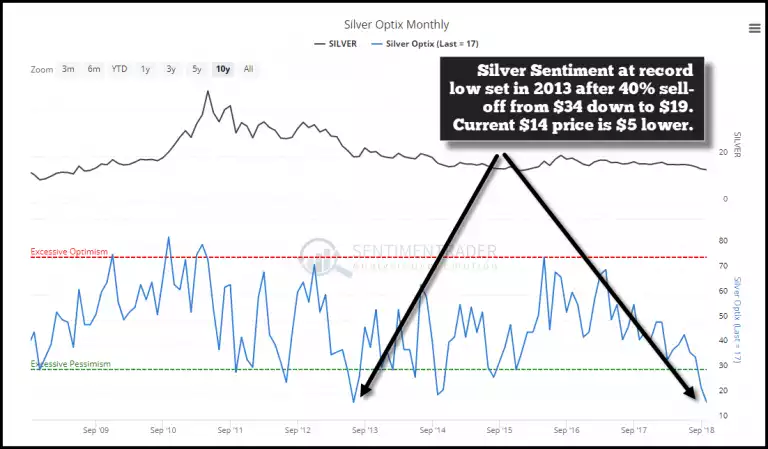
The speculative money of the managed funds are correspondingly net short, something rarely ever seen. Just 3 months ago they were net long 50,000 contracts (50m oz!) compared to net short now by around 25,000 contracts or 25m oz of paper silver. Why? Because sentiment is rock bottom. We wrote about the sentiment set up a few weeks back here. It has the makings of a short squeeze of epic proportions.
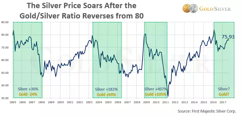
One chart not included in that SRSrocco article that we think should be at the front of everyone’s mind is of course that Gold Silver Ratio. At the time of writing it is sitting at nose bleed 83 levels. The chart below is a little out of date but it is still our favourite as an indicator of what often happens from these highs. Looking further back, of the 7 times in history that the ratio exceeded 80, 6 of them were quickly followed by a rally in both gold and silver but with silver well outperforming gold.
