Jobs Reality and the V Shaped Recovery
News
|
Posted 18/09/2020
|
9296
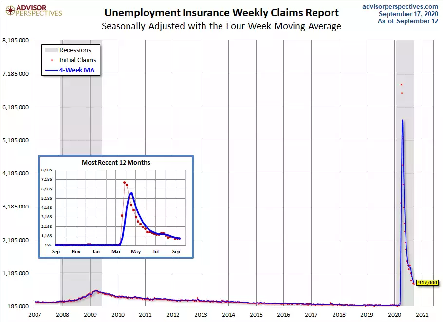
Another sea of red on Wall St last night with everything sold off. The reasons are not completely clear but it would appear to be a mixture of the Fed not being dovish enough yesterday (we want MOAR!) and worse than expected US initial jobless claim numbers. In a world where everything is relative, the market had been high fiving over weekly initial jobless claims being less than 1 million for 3 weeks in a row. Last night’s print was a worse than expected 860,000 (912,000 seasonally adjusted). Whilst without the benefit of perspective 860,000 new jobless claims in one week seems awful, we need to remember just how incredibly bad it was back in April when we were seeing over 5m week per the chart below.

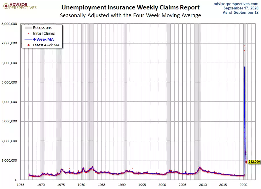
But the issue with a glance of the above chart is it appears like the V is in and we are back to normal levels. When you zoom out all the way back to 1967 when the data began and look closely you can see that 912,000 is at least 50% higher than the worst periods of any recession before it!

Now closer to home we also saw high fiving and a surge in the AUD on our ‘better than expected’ unemployment figures yesterday. The headline figure that most don’t look past saw 111,000 new people employed and the unemployment figure dropping from 7.5% to 6.8%. Pop the cork, toast and move on. However a scratch of the surface reveals things aren’t as awesome as they seem (if 6.8% could be considered awesome). Welcome to the ‘gig economy’.
Nearly all those ‘new jobs’ are newly self employed people hiring themselves out. As Deutsche Bank economist Phil O'Donaghoe explains:
"Delivery drivers, and riders, of major online delivery services are not employed by their respective delivery companies,"
That’s not to say we have 111,000 new bike riders with eskies on their backs, as there are also a lot of businesses reluctant to hire full time employees amid such uncertainty, preferring contract or casuals, and so there is an element of that reflected in numbers too.
So whilst unemployment dropped 0.6%, underemployment held steady at 11.2%, participation rate barely moved, up 0.1% to 64.8%, aggregate hours worked also up just 0.1% but average hours worked plummeted to a new all time low:

Yesterday’s unemployment rate drop came as a surprise to analysts because they are looking at the government payroll jobs index beforehand which indicated things got worse not better. The problem is that data works off Single Touch Payroll data which only counts ‘normal’ PAYG employees whereas the ABS count all these self-employed giggers as employed. However the ABS figures also count the 3.3m Aussies on JobKeeper, many of whom are not working at all but still counted as employed.
Roy Morgan try to overcome the shortcomings of the ABS data, strips out the aforementioned anomalies to reflect who really has a job and who is really underemployed. It’s a dataset of 4000 people so must be considered as imperfect as well, but at least it is based on reality not numbers more favourable for the ABS’s employer…. The chart below is for August and so doesn’t reflect yesterday’s ABS numbers. As you can see below they have unemployment at 13.8% and combined with underemployment, the total number of people looking for or more work, at 22.8%. Over 1 in 5 Aussies aren’t getting the work they need to make ends meet or at the very least boost our consumption (the biggest contributor to GDP) or pay their mortgage outside of government handouts.
As we wrote yesterday, this is all before the wind-back of said handouts and hence we are still in a false reality. The first 2 charts above are incredibly instructive on so many levels. When you have such an unprecedented situation as we saw in April and May, distorting the scale of charts like these or GDP or nearly any other economic measure, people can easily ‘see’ a V shaped recovery. Human nature wants to see it. The reality is that the right hand side of the V is, on nearly any measure, still far worse than any recession beforehand. Likewise things like PMI’s where 50 is the magic line between contraction and expansion, are often looking ‘strong’ now as they are above 50. What is being lost is that it is just above 50, just expanding, off an unprecedentedly low base. That is not a V.
It may therefore be too early to be abandoning ‘risk off’, rotating to ‘risk on’ on a narrative of everything becoming awesome. We are a long way from awesome but with shares and houses priced like we are.