It's Worse Than They Say
News
|
Posted 07/09/2023
|
2525
'Soft landing', 'pivot incoming', 'the central bank will save us', and 'we are in a bull market' - are these likely, or just hopeful investors looking for something to save them? One of the only things more draining than doom-and-gloom is a persistent stream of 'hopium'. Let's look at classic market health indicators, see what they are telling us, and explain why.
SP500 - daily candle chart
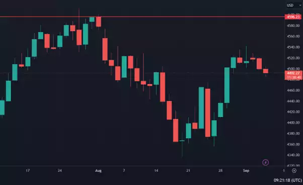
As fear enters the markets, we can see the preeminent index begin to wither. Its hard rejection from the 4596 level led to a virtually uninhibited fall, but its reattempt has suffered a strong retracement. Last night saw it fall another 31 points (-0.7%) to close at 4465. This does not mean that it will not rise for a retest or break higher, but it does reveal that fear has started to crack the narrative. Morgan Stanley's CIO, Michael Wilson, seconded this recently by saying that investors are pricing in too much optimism for the US markets.
US Dollar Currency Index - daily candle chart
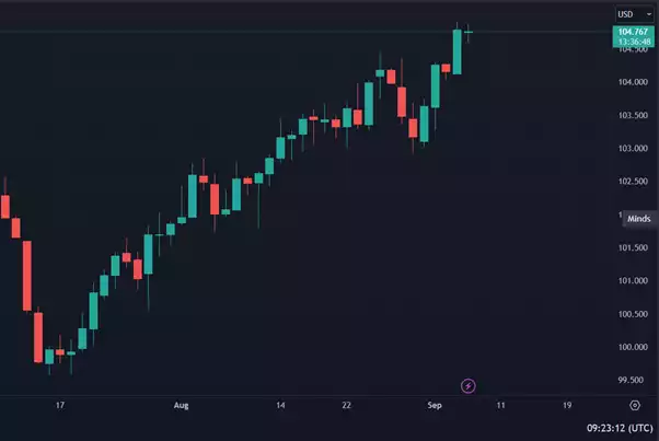
A rising US Dollar Index is a classic sign of a downturn. When investors begin to pull money out of US investments for safety or necessity, they are not simply causing one reaction. What investors are actually doing is trading back their investments for currency. As more investors pull out, this creates competition for that currency (USD) and can cause a spike in price. In this case, we see a steady rise that becomes more aggressive, spiking aggressively in recent days.
Copper - daily candle chart
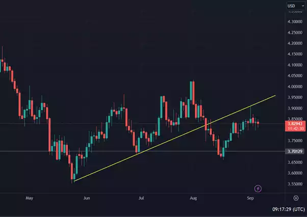
Copper: The industrial powerhouse metal. In August it looked like a surefire bet that copper was going to skyrocket on some timeframes, but as we revealed in a previous article, it was a major false breakout. After the fakeout, copper has fallen underneath its major trendline (in yellow) and suffered a serious rejection a few days ago. This is a horrible sign for global industry.
So, what is the potential good news?
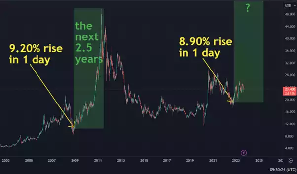
It could be in the medium-term as investors are always looking for somewhere to put their money. After the Global Financial Crisis in 2008, silver experienced an over 370% increase across the next 2.5 years. A very unique occurrence marked the beginning of this run: A 9.20% rise in one day. This could signify extremely large buy-ins from those predicting a price increase.
An oddly similar price action happened in late 2022. The analysis on the chart below was created the day after that event. So far, the patterns then and now look very similar. If Morgan Stanley and the above range of market health indicators are correct and there is an incoming drop in stock markets, will investors again flock to precious metals as safe havens?
Silver/USD - weekly candle chart