‘In Gold We Trust’ Preview – Printers go brrrr
News
|
Posted 08/03/2021
|
8056
The ‘In Gold We Trust’ by Incrementum report is arguably the pre-eminent annual report on gold and silver, read by over 2m people in 2020. Whilst we are still over 2 months away from the release they have given us a teaser with a chart pack. We will go over these charts with out own commentary over this week.
First, much of what drives the forecasts for gold and silver and indeed the whole financial space now is the extraordinary extent of both debt and monetary stimulus, the latter further inflating the former.
For timely context they took the following quotes from a Wall Street Journal article titled “Welcome to the Era of Nonstop Stimulus”:
“But with President-elect Joe Biden now making it clear that the recent $900 billion stimulus will “at best only be a down payment” and the now $3.3 trillion of total stimulus spending “is just the beginning,” it sounds like America is headed into a program of permanent stimulus.”
“How does it end? With Treasury debt already set to reach 108% of GDP, and Fed assets to finance that debt already 7.8 times the precrisis level in 2008, it isn’t a question of if government is going to run out of other people’s money, but when.”
The following chart puts this Government debt and deficits into perspective. Analysts often talk about the ‘drag’ effect carrying so much debt creates. When looking at it, remember the cost of servicing that debt is a key contributor to the deficits currently experienced. Whilst relatively minor to the huge fiscal spending currently deployed (way above receipts, hence the deficit) remember that this is at zero interest rates. You can see why the Fed CANNOT let rates rise whilst there is so much debt to be serviced.

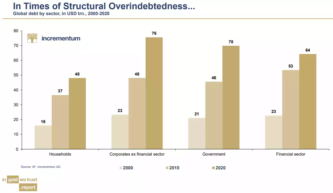
To put the extent of the current over-indebtedness into perspective just check out the following chart illustrating the relentless march upward since the turn of the century and particularly that of corporates as they debt fund share buybacks and other price stimulative tricks amid near zero rate debt opportunities:
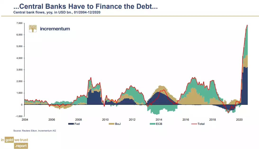
And to facilitate all that cheap debt, we can thank none other than the world’s central banks. The chart below is one of the most staggering in the financial world. It illustrates the magnitude of the QE unleashed by the west’s 3 biggest central banks, dwarfing any GFC response and in no way finished…
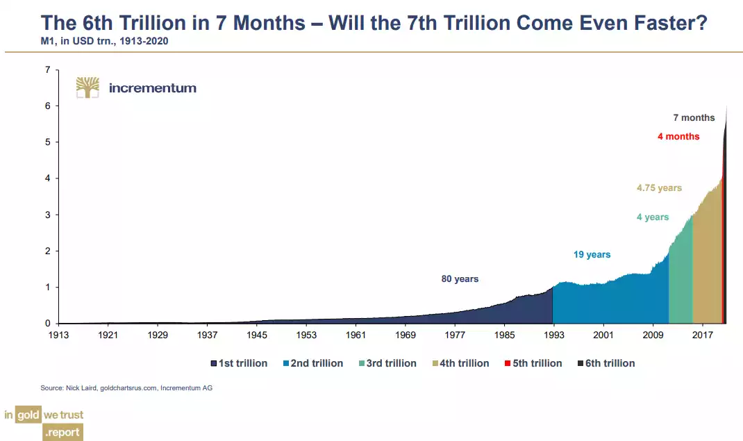
US Money supply, measured by M1 took 80 years (to 1993) to reach $1 trillion from the creation of the US Fed in 1913, and only really heating up when we left the gold standard in 1971. From 1993 it took another 19 years for the next $1 trillion thanks to a quick surge with QE1 after the GFC. And that heralded the start of QE. As you can see below, it took just 4 years for the next $1 trillion, 4.75 years, and then 2020 and COVID saw things blow out to just 4 months and 7 months consecutively. If the chart below is not a blow off parabola I don’t know what is:
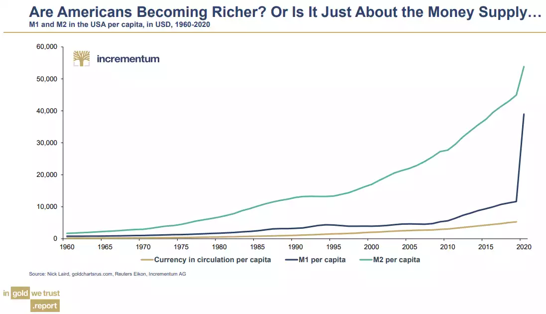
And yet as we know too well, all that money did not find its way to Main St, it purely enriched Wall Street with that aforementioned access to cheap capital whilst unemployment and stagnant wages for those employed help back Main St. The chart below starkly illustrates the simplistic difference between new money and actual new cash in circulation:
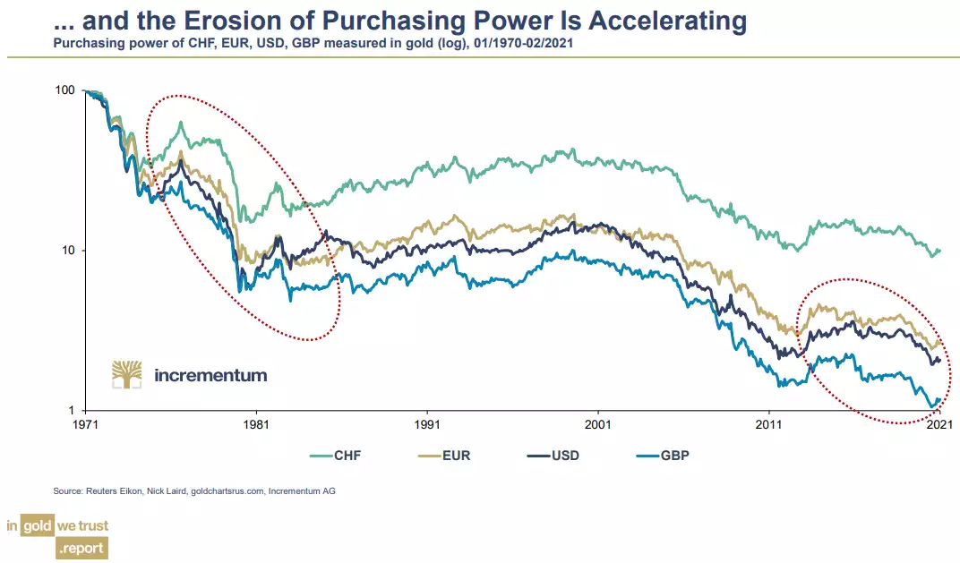
Fundamentally this all comes down to the debasement of the USD and Fiat currencies all around the world in general. A Fiat currency is one backed by nothing more than the promise of a government. Without the forced fiscal discipline a gold standard requires, a government can expand its supply by simply ‘printing’ more. Governments LOVE being re-elected and living large now at the cost of future (currently) non voting people or at least votes beyond their care factor. The parabolic chart above is not atypical of how this has always played out over millennia. We greedy humans just can’t help ourselves and so the Fiat cycle repeats. There is one form of money, real money, that has survived and indeed thrived in this cycle… gold. And so if we measure the ‘value’ of the world’s pre-eminent western currencies since we left the gold standard against gold, you can see they are heading to zero..
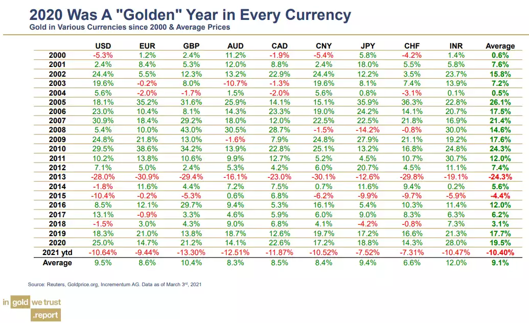
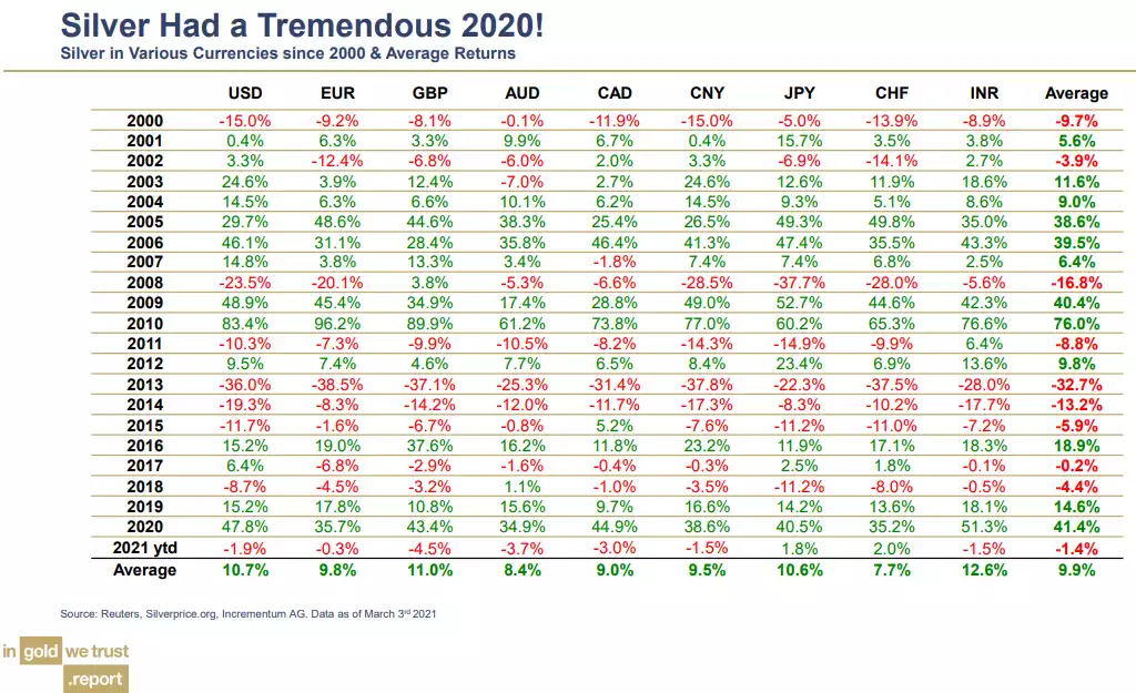
And so whilst gold has languished since August, this is largely due to the illusion that ‘everything is awesome’ and that somehow, somehow, the weight of ALL that debt will somehow disappear, and the central banks will idly allow bond yields to keep rising and that somehow servicing all that debt on higher interest rates would be OK. The reality of maths says otherwise. We will discuss this further in coming articles but let us leave you with the performance of gold and silver since the turn of the century across a range of currencies including our own AUD. One can look at the year to date performance as an omen of more falls to come (ignoring all that above), or a dip buying opportunity before things get very serious.
“Blessed are the young for they shall inherit the national debt.” - Herbert Hoover
