Gold & Silver Price - Indirect Analysis
News
|
Posted 15/12/2023
|
2639
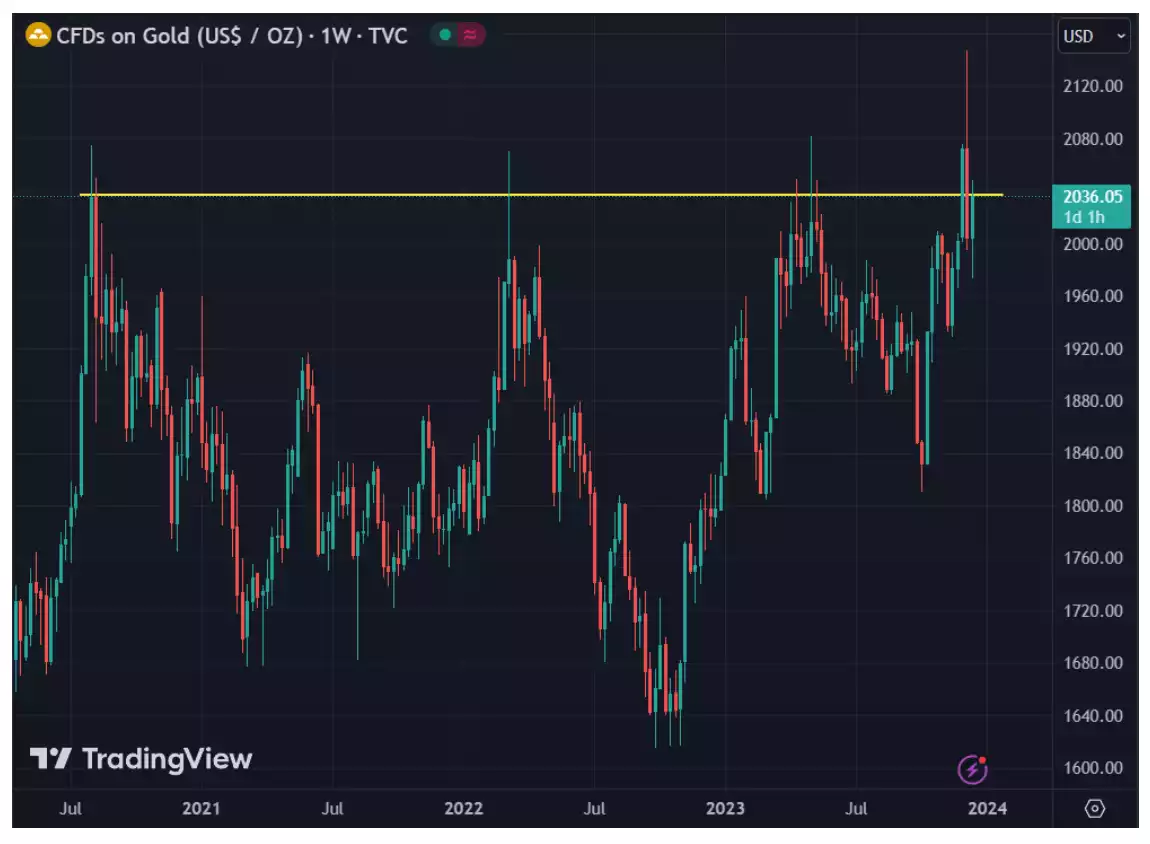
As gold is retesting major resistance and still has plenty of room until it reaches its all-time-high from last Monday, we can look at a few other charts to try and get a glimpse of the potential future.
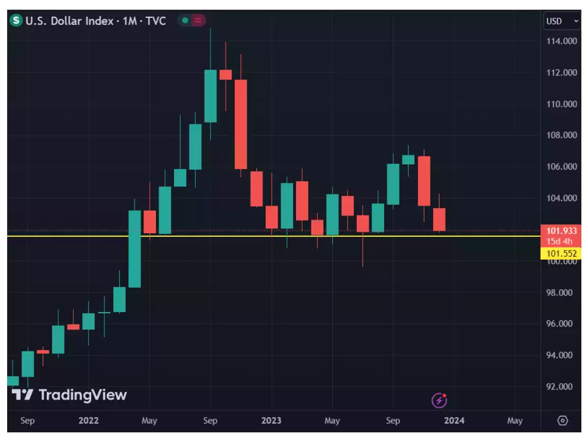
Below is the US Dollar Index. As you can see, it has not broken the 101.9 level since April 2022. The US Dollar gained most of this strength from rate hikes, as well as tough-talk from Powell on fighting inflation. As that has now faded from speculation, and then recently from the FOMC, the Dollar Index risks breaking this crucial support and triggering potential buy pressure on gold and silver.
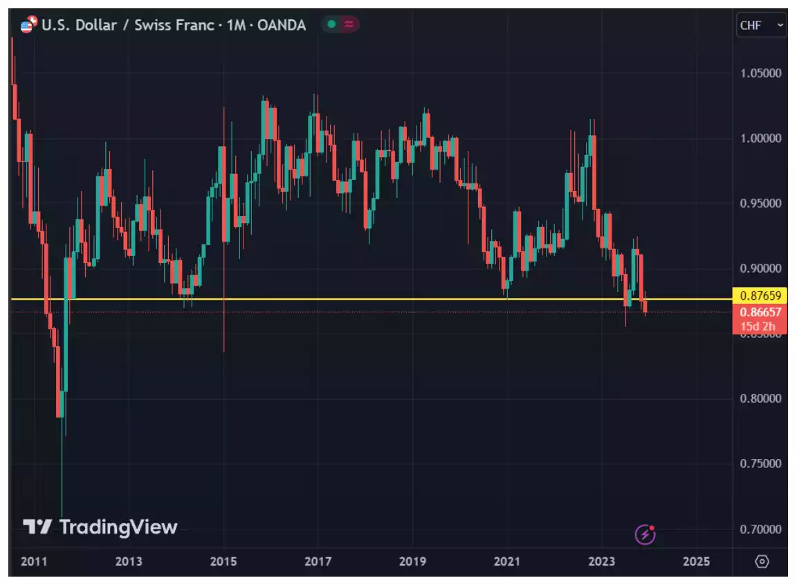
The US Dollar against the Swiss Frank (CHF) can be an early predictor of gold and silver's movements. This is in relation to it being one of the popular safe-haven currencies - a currency that is seen as stable in times of trouble. The Japanese Yen was also in this club, although we can see why it is no longer mentioned. The Swiss Frank's safe haven status is derived from the history of Switzerland being the place kings and other leaders would store gold in case they needed to raise an army. For this reason, Switzerland has always attempted to maintain political neutrality.
USD being the primary currency in the pair makes USD/Swiss move opposite to the Gold/USD price in many cases. It suffered a breakdown in July of this year and has just aggressively broken under again this month. One has to go all the way back to 2011 to find the last time it was testing such low levels.
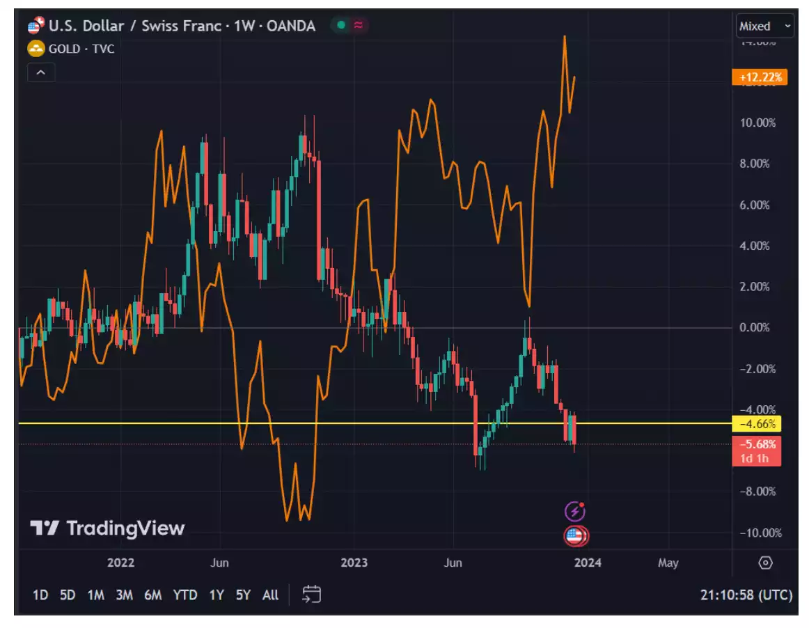
Gold may be still moving to rebreak major resistance, but if it follows USD/Swiss, that could mean that gold continuing upward is already a done deal. USD/Swiss has already rebroken major support and has virtually empty space below. One can clearly see gold on the chart below (orange) moving sharply opposite, upward.
Copper has been testing this descending trend line for one year. If we see it reach above this line (in yellow), that could validate a sharp rise in price. A rise in the price would indicate increased market liquidity from dovish policy, leading to pressure from consumers, and finally an uptick in industrial production.
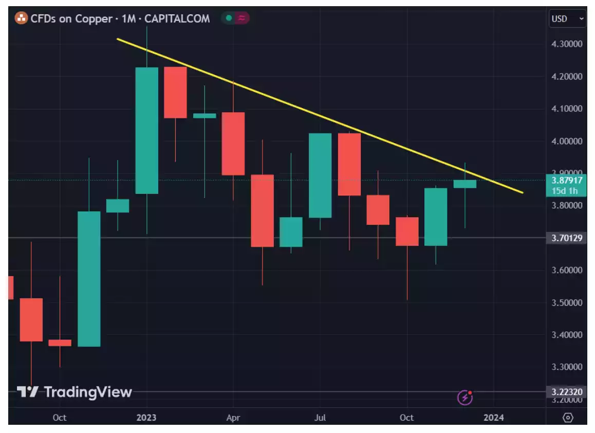
With thinner liquidity and the effects of the typical “Santa Claus Rally”, we could be in store for some major breakouts. Keep a close eye on the charts above to catch any potential early signals.