Global Debt – Biggest Jump Ever
News
|
Posted 21/09/2020
|
11183
BIS (Bank for International Settlements) has released its global debt report and Bank of America has summarised it. Whilst regular readers shouldn’t be surprised by the results, there are some remarkable movements and results, and Australia holds its unenviable “2nd Worst in the World” crown. Trading Economics outline worse to come for Australia…
But first from BofA:
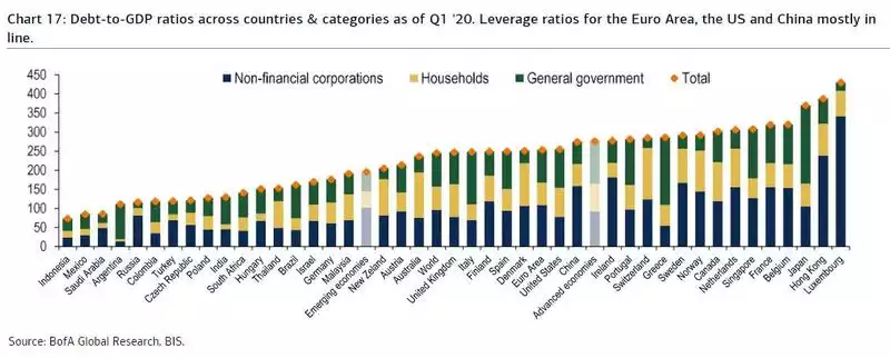
“Global debt/GDP surged to an all-time high in Q1 '20, with overall debt for the non-financial sector now worth 252% of global GDP. This is up from 241% at the end of 2019, the biggest quarterly jump ever according to BIS data.

The chart also confirms that central bank inflation targets are higher, much higher than the ""official 2%: to erase this debt, central banks needs inflation to be in the 10%+ range. Anything below that would require debt defaults instead of inflation to wipe away the debt... and that is unacceptable.
This increase reflects the fallout from the first few weeks of the COVID crisis, with most advanced economies implementing total or partial lockdowns in March. Hence, the historical contraction in GDP growth observed worldwide in Q2 and the debt surge from both governments and non-financial corporations will translate into an even bigger rise in the global leverage ratio in Q2 '20.”
Whilst this was the biggest jump in history they say the drop in GDP in Q2 will make it worse again. They note too that the EM giants of India and to a lesser extent South Africa have had late entries into the pandemic and with the OECD expecting 10.2% and 11.5% drops in GDP in Q3, the pain could well get worse into Q3.
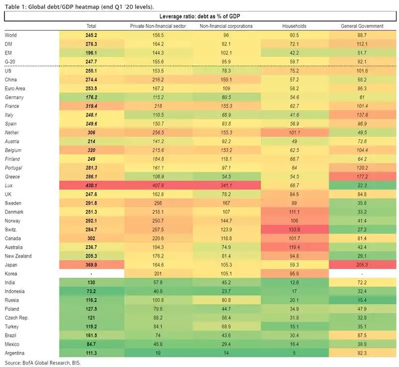
The ranking and breakup of the debt load is interesting to look at. Below it’s presented graphically and in a table. Your eyes might be drawn to the big yellow bar of Australia or the red warning shading in the table. Second only to Switzerland, our personal debt is “now” an eye watering 119.4% of GDP.
We say “now” as this is Q1 data. Since then we have had our GDP (the denominator) fall sharply. In terms of the numerator, the amount of personal debt we hold, we have had and the combination of mortgage holidays in which no debt is paid down and government home buyer grants sucking more people into the Aussie property Ponzi scheme and hence increasing the amount of debt. “Sucking” is also a key word as each and every one of these grants to prop up our beloved housing bubble is literally sucking forward future demand. In the past immigration has filled that void. Immigration is gone for an indefinite period now. Throw in stagnant wages and underemployment (as we discussed recently) and it becomes a very worrying cocktail.


Beyond that Q1 “now”, Trading Economics agree and quantify as follows:
“Households Debt To GDP in Australia is expected to be 124.50 percent of GDP by the end of this quarter, according to Trading Economics global macro models and analysts expectations. Looking forward, we estimate Households Debt To GDP in Australia to stand at 124.50 in 12 months time. In the long-term, the Australia Households Debt To GDP is projected to trend around 125.80 percent of GDP in 2021 and 126.24 percent of GDP in 2022, according to our econometric models.”
In the past Australia’s total debt to GDP, despite always being 1st or 2nd at the personal level, was contained by relatively low government debt. Our precious, election determining surplus countered all that personal debt. Since COVID and all the deficit funded government fiscal support that has come with it, our green shaded government debt in the above table is under threat. The RBA is banging the table asking ScoMo to step up with more rather than leaving it all to them. JobKeeper just got extended and of course the aforementioned property building grants but they want MOAR. Our corporate debt you will note is already in yellow and speaks to the concerns about the insolvency wave to come as no amount of stimulus can solve a solvency crisis.