Connecting the Dots – How we got into this mess
News
|
Posted 21/10/2022
|
18940
A little something different today. We are bombarded by charts and many of them sitting in the ‘extreme’ in whatever metric you are looking at. The one below should be front and centre right now but the metrics you are looking at are only half the story.
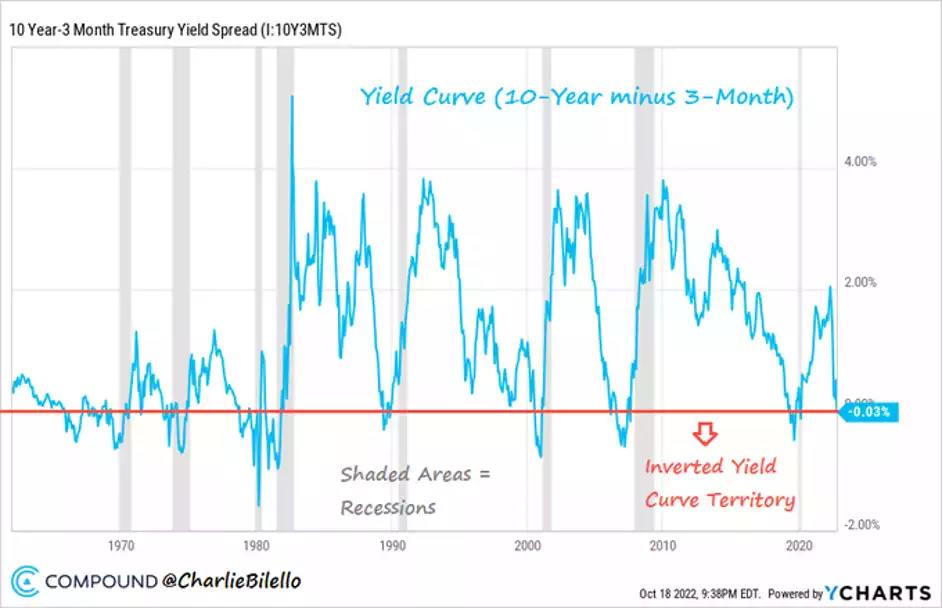
Yes, the last 8 recessions in the US were all preceded by an inversion of 10-year and 3-month US Treasury yields. On Wednesday that inversion occurred for the first time since the COVID crash in 2020. But unlike then this time we have the kicker of the 10 year UST having a yield of 4% and 8% inflation! There is no ‘Fed to the rescue’ fairy tale ending here.
So lets revisit how we got to this situation with some non-static charts for a change. Sometimes we forget the journey when we sit at the destination…
First lets remind ourselves of how gold, real money, has held value compared to Fiat currencies around the world…
or
Part of the problem with that debasement of currencies, and you could see the kicker above from the GFC, is the prolific amount of new currency created by central banks. Quantitative Easing sees them ‘print’ new currency and buying bonds with it. The graphic below shows you how just how ‘prolific’ that was…
Such debasement of currency ordinarily leads to inflation (more money chasing the same amount of things). As we all now know, the mechanism of that printing just saw financial assets and property inflate, enriching the rich, but until last year it didn’t flow through to ordinary goods and ‘Main Street’. The graphic below shows you how house prices have responded since the 80’s after the penny dropped that we were no longer tied to the discipline of gold and you could borrow newly created currency to buy one… It’s a bit of a Bledisloe Cup battle between Australia and NZ with the same result we’ve gotten used to in rugby too….
Aussie housing ended up 290% in that period. Another ‘hard asset’ protecting wealth amid such currency debasement is gold. Its up over 400% in the same period. One of the two looks overvalued right now and one arguably undervalued…
Finally, the next graphic puts the current ‘shocking’ 4% 10 yr US Treasury yield mentioned above into perspective (the graphic ends in April 22’s 2.8% but you know the rest). The $300 trillion question today is whether that 40 year decline in yields may be coming to an end and we are witnessing a breakout of that established channel that has fuelled this distorted, debt fuelled financial largesse. Never has the world held so much debt and never could rates get back to previous levels with such a burden. Something must and will break.
There is nothing new above for regular readers but sometimes we need to revisit the journey and connect the dots.