Comparing New Currency, Gold and Silver – Stunning Charts
News
|
Posted 25/05/2020
|
26306
You can now listen to the article and all our daily news, via YouTube and Anchor
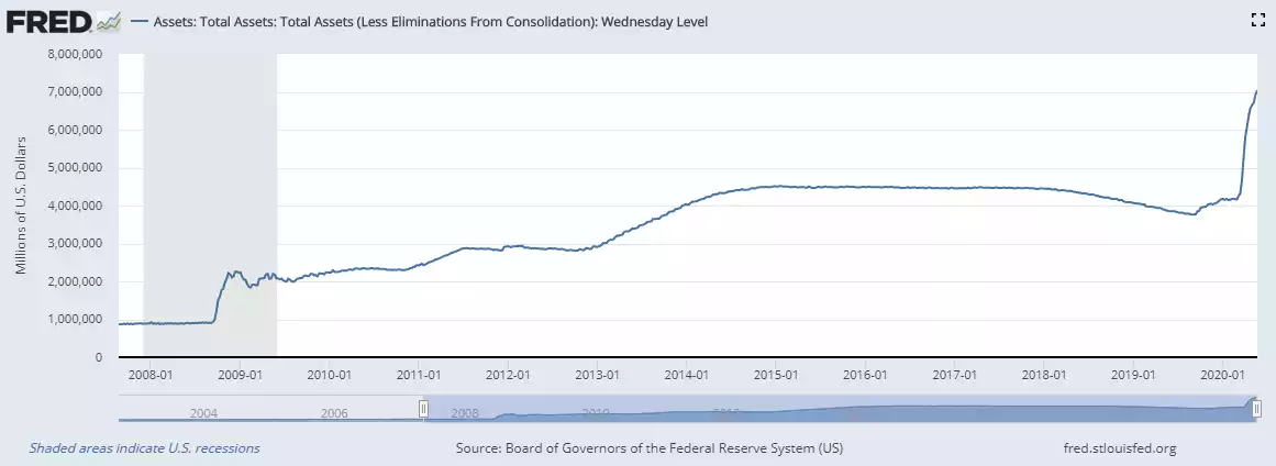
We are at an interesting juncture of the economic response to the COVD-19 induced crisis. We and others have written extensively on the unprecedented scale of digital money expansion of the Fed and US government. The Fed’s balance sheet has now increased nearly $3 trillion over the last couple of months to total more than the value of all the gold ever mined, over $7 trillion. Whilst colloquially referred to as ‘money printing’ there is little printing involved, rather the tapping of a few keys on some computers, and voila they create more money than ever before.
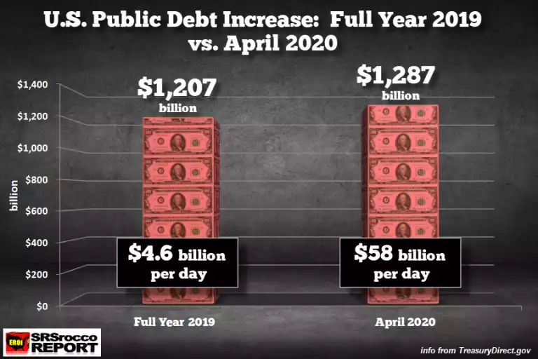
And US government spending increased more in April than all of 2019, nearly $1.3 trillion…
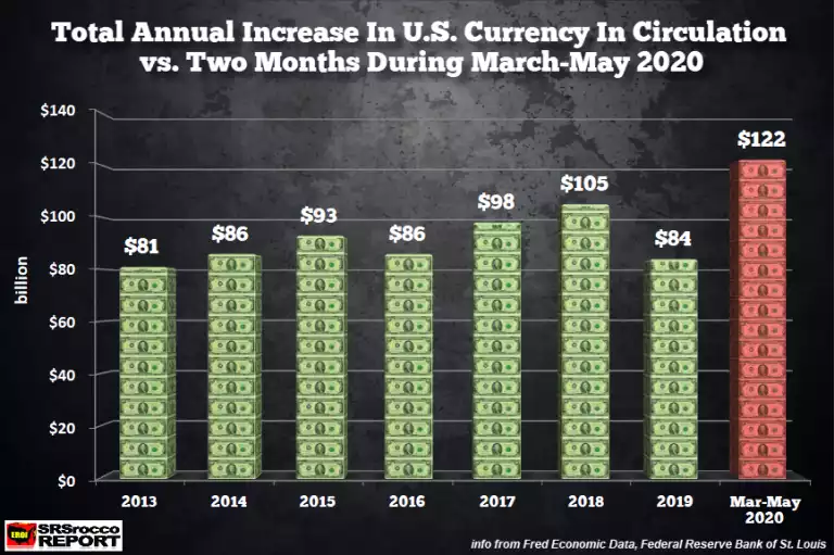
But few talk about the actual printing of paper notes, “dollar bills”, and they haven’t exactly mucked around there either. According to the Fed themselves, currency in circulation increased by no less than $122 billion in just the period March to May. The following charts put that in to perspective when compared to the entire years since 2013 when the digital printing presses went wild…
Now comparing that to REAL money and to highlight why precious metals are real money by virtue of intrinsic value through constrained supply, let’s look at how much gold and silver could be bought with those freshly printed dollar bills in the context of production. Last year the world produced 800m oz of silver and 111m oz of gold. (Of course those following the GSR right now will be dividing 800 by 111 = 7:1, comparing it to the current 100:1, and probably feeling pretty good about their silver investment…). So when you do the math and chart that, it puts it all into perspective…
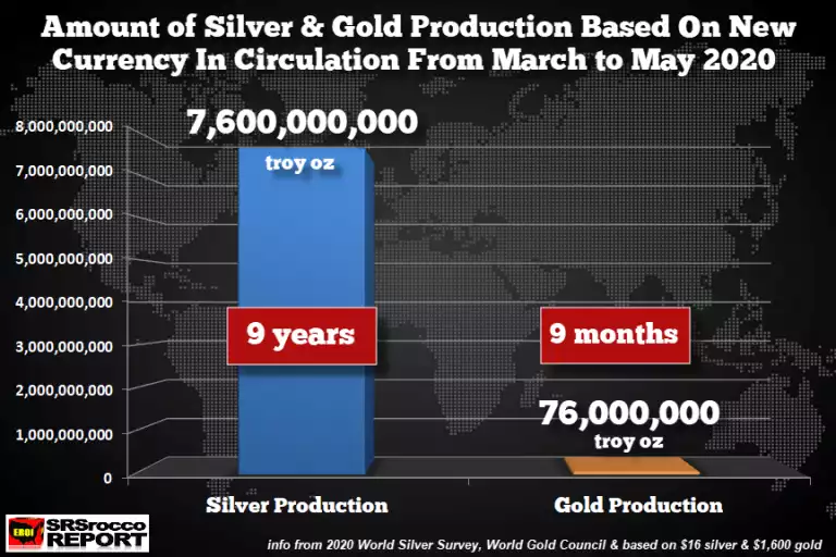
To spell that out, it would take 9 years of silver production and 9 months of gold production to equal just the dollar bills created in less than 3 months. The speed of this increase in comparison to total circulating notes too is staggering and may talk to another issue. At 31 December 2018 total currency in circulation was $1.67 trillion. In less than 17 months that has risen 15% or $250 billion. As you can see above almost half that happened in just the last 2 months. Check out the vertical nature of that period in the chart below.
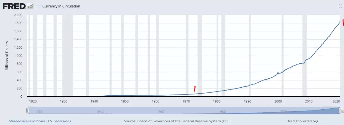
There are a couple of takeaways in this chart. First, yet again we are looking at a chart that starts to leave, becoming parabolic, decades of sound money from 1973 when we left the gold standard. Secondly look at the jump in circulated notes during the GFC in 2008/9 and compare to the more vertical and already comparable jump just in these 2 months. There will be many explanations but a large part of this demand for notes is as people withdraw cash from the bank on concerns of a bank run, bail ins, and cash bans. Australia has already seen a massive demand for new notes as cash is withdrawn from banks.
If you are ‘going to cash’ ahead of further market turmoil, consider the difference between currency and real money.