CAN THE US FIGHT THE ECONOMIC TIDE?
News
|
Posted 26/10/2018
|
9410
Wall St bounced back last night albeit not getting back to its 200DMA. Tonight will be interesting as Amazon results disapointed after close of trade and it was down 5% on futures. Dead cat bounce or not, there are plenty of headwinds for Wall St on the global stage, and not discounting their domestic situation.
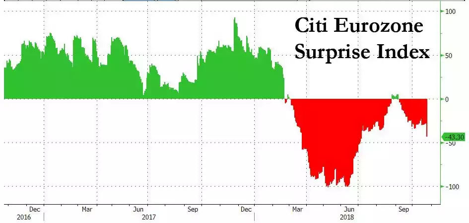
Last night the European Central Bank met and market hopes were high that they would ease their tightening schedule amongst the pronounced slow down in the Euro economy of late and the political instability courtesy of the Italian budget saga and deteriorating Brexit negotiations (which took another turn for the worse last night). Citi tracks such dynamics with their Eurozone Surprise Index.

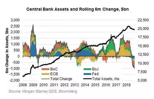
But it wasn’t to be and Mr Draghi held strong with his tightening agenda albeit with a cautionary tone. Canada’s central bank on the other hand yesterday removed all ‘caution’ from their language and raised rates again removing ‘gradual’ from the minutes. Indeed as you can see from the chart below the world’s big central banks are collectively tightening:

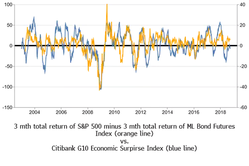
We’ve observed a few times of late the apparent disconnect between the bullish US market and the rest of the developed world, wondering how long that can last. Maybe, just maybe, the falls on Wall St this month have been the beginning of an alignment. Kevin Muir of Macro Tourist put together the following chart (extending one of the same done by Reuters stopping at 2012) which clearly shows a correlation between the same Citi Economic Surprise Index depicted above but for all G10 countries, and the difference in returns between the risk-on S&P500 and risk-off Bond market (represented by the Merrill Lynch Total Return 10-year bond note index).

Whilst the amplitudes differ the pattern is clear (albeit not great between 2014 -16 as the Surprise Index skirted zero). As the central banks of the majors in the G10 tighten into weakness one could well assume that blue line is about to head south. Indeed you can see it has already rolled over. History dictates then that the orange line will follow suit. Whilst the orange line is the difference between US shares and bonds, in such situations gold is usually correlated with the ‘safe haven’ bond market part of that dynamic, rising amid the rush to safety. The chart reinforces that the US is inextricably linked to the rest of the world and it’s apparent (albeit already with cracks appearing) economic strength cannot overcome the broader global weakness.